Food brand
Once upon a time, in the bustling world of commerce, a new brand was born - Amazing Foods. This brand had a noble mission: to serve the masses with raw food products, fresh and direct from the farms.
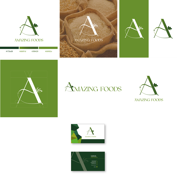
The first brush stroke in this brand’s design was its logo. Simple yet impactful, it was a symbol that encapsulated the ethos of farm-fresh products. It was as if one could see the green fields, the crops, and the sun rising over a farm every time they looked at it.
The color palette was chosen next. A vibrant shade of green painted the brand’s visual identity. This color, often associated with nature, freshness, and vitality, perfectly aligned with Amazing Foods’ mission.
Typography was another critical element. A simple and clean font was chosen, reflecting the brand’s commitment to simplicity and ease of use. It was as if each letter echoed the brand’s promise of easy trade.
Then came the imagery. High-quality images of fresh produce, farms, and farmers were carefully selected. Each image told a story of freshness and quality, reinforcing the brand’s commitment to farm-fresh products.
The layout and composition were designed with care. The elements on each page were arranged in a simple and uncluttered manner, guiding the viewer’s eye and making information easy to process.
Packaging design was another crucial aspect. Transparent sections or windows were incorporated into the packaging design to allow customers to see the product, ensuring product visibility while communicating freshness and quality.
Finally, consistency was maintained across all platforms - from packaging to digital spaces like websites or social media platforms. The same green color palette, typography, imagery style, and logo were used everywhere.
And so, Amazing Foods came to life - a brand with a strong visual identity that communicated its core values of freshness, quality, and direct trade effectively.
