UI Design Project
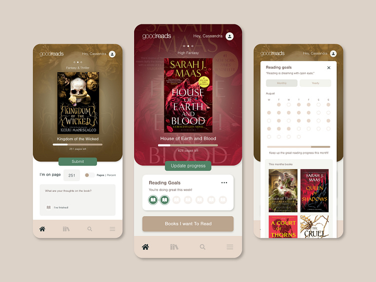
The "GoodReads App Redesign" project was born out of a passion for improving the user experience of the Goodreads mobile app. The existing design, has a dated brown theme and less-than-ideal user journey. Which I feel doesn't do justice to the joy of reading 📖
The primary objective of this project was to create a fresh and user-friendly interface that would revitalise the reading experience for users.
The project aimed to revamp the entire user flow of the Goodreads app, ensuring that it not only functioned seamlessly but also departed from the conventional 'bookish' design aesthetic commonly associated with reading apps.
This project was a personal venture, led by myself with assistance from my partner. I utilised Adobe XD for app design, and Adobe Illustrator and Premier Pro to showcase the final product.
Approach
To achieve the project's objectives, I decided to explore and educate myself. This included watching numerous YouTube tutorials, revisiting fundamental design principles, and adopting a reader's perspective. I strived to align the redesign with the Goodreads brand identity while incorporating design hierarchy and techniques to enhance usability.
Challenges
While not a significant challenge, I discovered that designing every screen of an app required meticulous attention to detail. To maintain creativity and freshness, I took regular breaks and continued to seek inspiration from online resources.
Results
The outcome of this project is a completely overhauled Goodreads app design. I am really happy with the result, and this project has not only allowed me to acquire new skills but has also changed the way I approach design work in my day job.
This project has cultivated a desire to delve deeper into the principles that underpin the creation of beautiful and functional apps, with a strong focus on user-centered design. I also aspire to gain a deeper understanding of the psychology behind user interactions.
Looking ahead, I am eager to tackle a new project, possibly focusing on a dark mode or an app with predominantly dark backgrounds. My goal is to create a sleek and impactful user experience that reflects evolving design trends.
If you're a UI/UX designer and you have any feedback on my project, please share in the comment ☺️ Thanks for looking.


