Logo Designing & Branding - Point Delivery

The Point Delivery company is known for its reliable and efficient delivery services. Customers can trust the company's punctuality and consistency in delivering orders on time, which has earned it a good reputation.
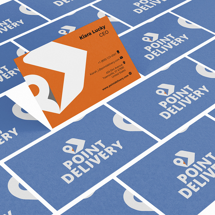
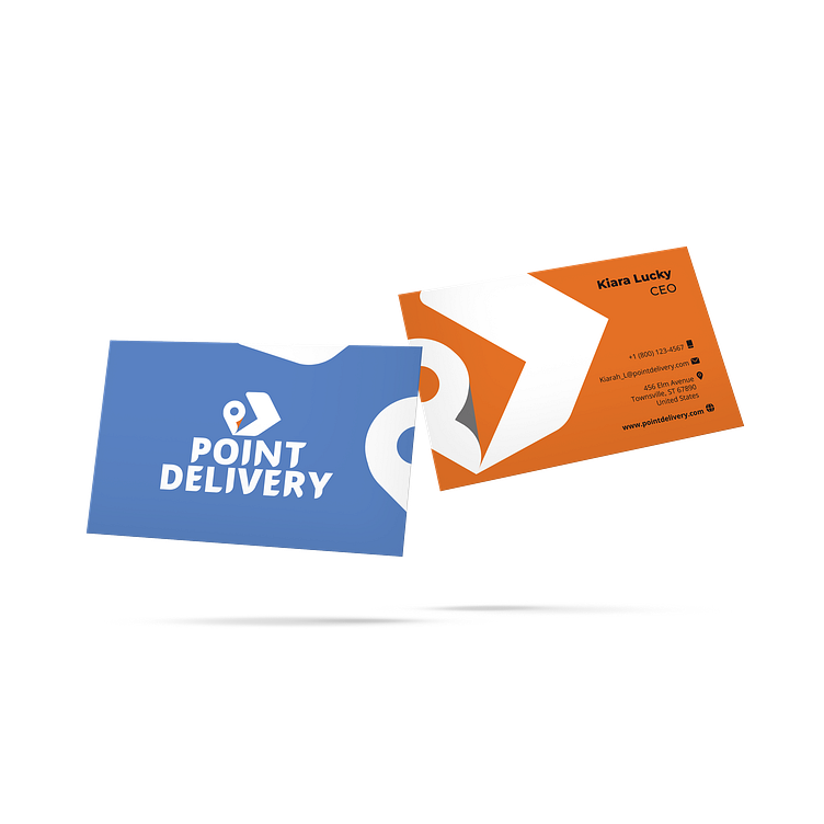
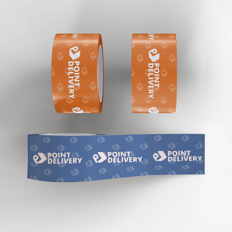
The company logo is a clever combination of symbols that are related to its services. The logo uses the location pin, the letter P, the box, and the forward arrow as its main icons. The location pin is designed to resemble the letter P, which is a smart way of incorporating the company's initial into the logo. The forward arrow completes the design by forming a box, which symbolizes the idea of moving forward and advancing.
The fonts used in the logo are unique and customized to match the letter P. This brings a sense of unity and cohesiveness to the overall design, making it visually appealing and easy to remember.