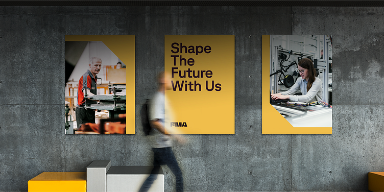
FMA Visual Language
With a logo inspired by sheet metal shapes, we began to look at punched sheet scraps for visual language inspiration. Each piece of scrap metal has a myriad of interesting geometric patterns in the negative spaces. Without ever showing the presence of metal, the shapes and their repetition felt representative and ownable. Using a formula of geometry, sharp corners, even spacing, and angles, we constructed a shape language that’s simple, unique, and meaningful, while being flexible enough to be worked into nearly any layout application.
The shapes can contain images, text, solid colors, texture, and other content types, making them extremely easy to use and practice for the design system.
In addition, we introduced a line version of the visual language derived from the same sheet metal inspiration. Not only does it provide extra texture, it communicates technique — engineering plans, dielines, and such. In that spirit, every FMA layout is built from a grid system to show unity and cohesion.
Check out the full case study: https://focuslab.agency/work/fma
------
Looking for a brand agency? We would love to hear from you.
Email us: hello@focuslabllc.com


