Touchstone Healing Arts Branding
Project Overview
Touchstone Healing Arts, a seasoned player in the realm of massage therapy and energy work, presented an exciting challenge: creating a brand identity from scratch after operating without one for years. The founder emphasized the need for a distinctive logo that could encapsulate the healing and transformative power of her hands-on services. My task extended beyond the logo to include business cards, gift vouchers, and door signage that would collectively create a cohesive brand image.
Objectives
To design a logo that represents the unique energy work and healing massage services offered by Touchstone Healing Arts.
To extend the brand identity across various marketing collateral including business cards, gift vouchers, and door signs.
To create a unified aesthetic that ties all these elements together, fostering instant brand recognition.
The Logo
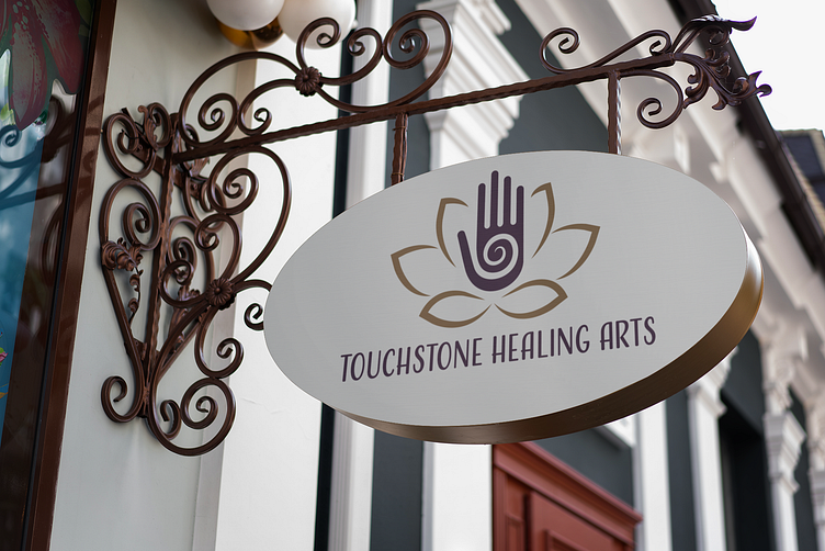
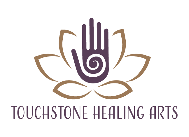
The logo features a hand with a spiral at its center, all set within the form of a lotus flower. The hand symbolizes the practitioner's skilled touch, the spiral represents transformative energy work and healing, and the lotus flower adds a layer of spiritual and holistic symbolism. This harmonious blend of elements evokes feelings of peace, balance, and wellness. Muted, earthy colors were chosen to keep the focus on the intricate elements of the hand, spiral, and lotus, lending the design a timeless and organic feel.
Building upon the brand identity established by the logo, we designed business cards, gift vouchers, and door signs that offer a seamless brand experience. Each element is a natural extension of the core brand identity, featuring the same color palette and typographic choices.
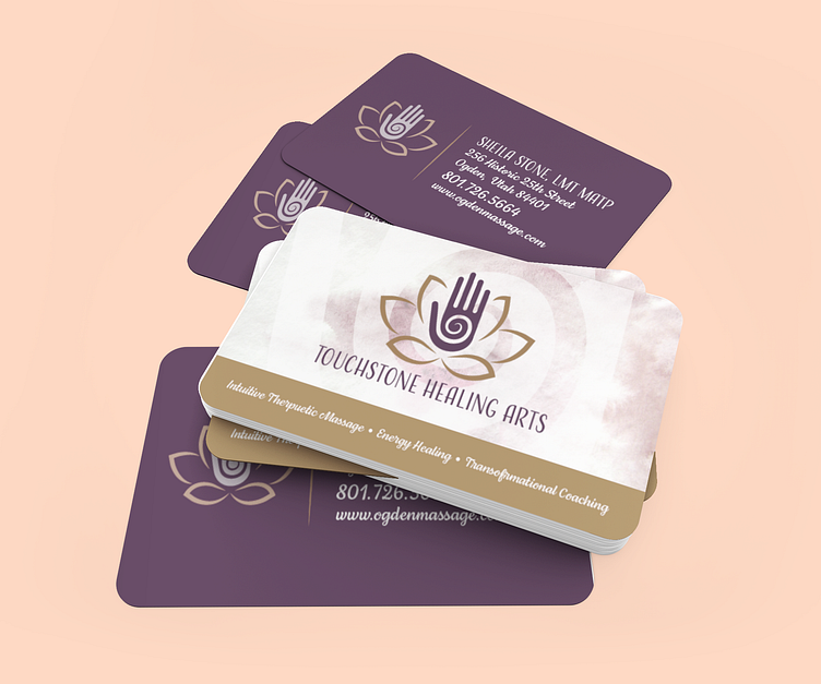
Business Cards: These serve as mini-billboards for the brand. The front features the logo and practitioner's name, while the back provides contact details against a backdrop of the signature spiral design, subtly reinforcing the brand's core symbol.
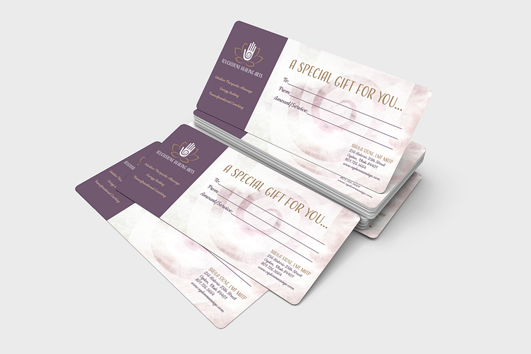
Gift Vouchers: The vouchers not only provide practical information but also convey the brand's philosophy through the use of imagery, typography, and color. Each voucher serves as an invitation to experience the healing arts, making it a truly special gift.
Door Signs: To welcome clients into the healing space, the door signs were crafted with care, integrating the logo and color scheme. They serve as the first point of physical contact between the brand and clients, setting the tone for the transformative experience within.

Typography & Color Palette
I chose a clean, elegant typeface to complement the delicate lines of the hand and spiral in the logo. The earthy, calming colors used across all items extend the brand's message of natural healing and inner peace.
Results
Touchstone Healing Arts now has a compelling and cohesive brand identity that resonates with its core values and services. The client was thrilled with the logo's visual translation of her unique services and equally pleased with how this identity extended to all aspects of her practice through the business cards, gift vouchers, and door signs. Through thoughtful design, we've given shape and voice to a brand that has long deserved to be seen and recognized.
