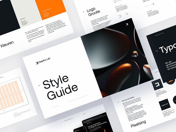
The funny quirks of a style guide.
Hi Dribbblers,
We've been working on loads of style guides lately. The classification of all elements are usually the same. What is the most uncommon chapter you had to include in a style guide? For us it was a chapter about materials and textures of those materials to fit a brand. It was a lovely experience talking to suppliers and manufacturers. This gave a new depth of understanding a brand and gave us the opportunity to get out of the office and in to the world!
We would love to hear your story's about style guides and their individual quirks.
Hope you have the best inspirational and productive day!
Interested in partnering with us?
Get in touch at info@graphiclab.nl or visit our website graphiclab.nl.
Follow our updates on:
More by Graphic Guide View profile
Like

