Mastering Chip Design: A Comprehensive UI/UX Tutorial
Chips UI design guide
Upgrade your UI/UX skills with a stylish journey into Chip design: Uncover anatomy, states management, styling effects, and usability tips.
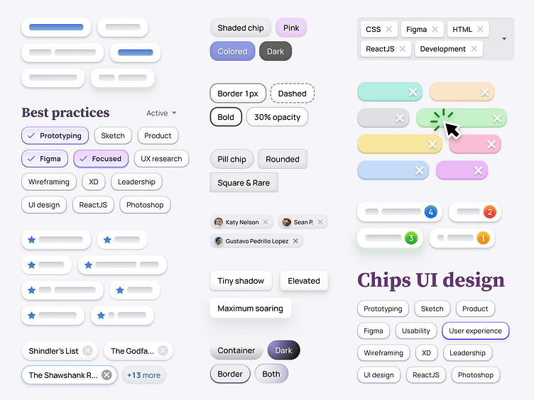
Chip — is a small, interactive component that serves as a visual representation of a specific input of attribute or an action. Also known as a Badge, the Chip typically consists of a simple shape or container with succinct text or an icon, often accompanied by additional visual cues or status indicators.
Chips are commonly used to showcase various types of content, such as categories, labels, status tags, or product attributes. By allowing users to click or tap on them, Chips can trigger actions, facilitate filtering options, or display more item's details.
By the end of this UI design tutorial, you will have a solid understanding of how to create visually appealing and user-friendly Chip components that enhance the overall experience of your application.
6 mins full read 👉 https://setproduct.com/blog/chip-ui-design
