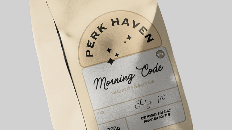
⭐️Packaging design | Perk Haven coffee

The packaging design concept for Perk Haven coffee can be modern, stylish and at the same time reflect the values of the brand. Here's a suggestion:
Color palette:
Use neutral and natural colors such as brown, beige, deep chocolate, and turquoise (as an accent color). This palette will emphasize the naturalness and quality of the product.

Enter your text here...Design:
On the front of the package, place an abstract image of a coffee tree plantation, symbolizing the origin of the product.
Texture and material:
Consider a material with a natural texture, such as matte paper or kraft paper. This will add a tactile element to the packaging and align with the natural values of the brand. You can also add a light matte varnish to add extra texture and shine to the packaging.
Enter your text here...Accents:
Use turquoise for accents, such as the outline of the logo and product name. This color can symbolize the purity and refreshing taste of coffee.
Product Information:
On the back of the package, include information about the origin of the beans, roasting methods, cooking instructions and brand history. It is important that the consumer can obtain detailed information about the product.