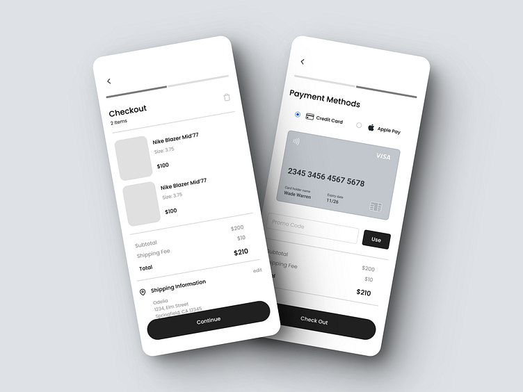
Checkout & Payment Wireframe Concept
Hello Dribbblers,
Excited to share a sneak peek of our latest project - a seamless and user-friendly checkout experience! 🚀
In this wireframe, we've focused on creating a streamlined flow for a two-step checkout process:
Checkout Page:
Clean and minimalist design to display your selected items 🛍️
Itemized list with clear product names and prices 💲
Intuitive "Continue" button to proceed to payment 💳
Payment Page:
Smooth transition to the payment process 🌐
Secure and efficient payment handling 🛡️
A user-friendly interface for a hassle-free payment experience 🙌
Stay tuned for more updates as we bring this wireframe to life with stunning visuals and interactive elements. 🎨✨
👉 Have feedback or suggestions? Drop them in the comments below! Your input helps us create better user experiences. 📣
#UI #UX #Checkout #Payment #Wireframe #DesignConcept #Ecommerce #WebDesign
Press "L" if you're as excited as we are about creating a frictionless checkout process! ❤️

