"Versus Screen" Game UI
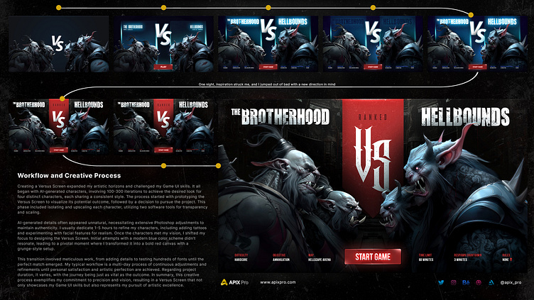
In my quest to craft a captivating Versus Screen, I aimed to push the boundaries of my Game UI skills while venturing beyond my typical graphic design endeavors. It all began with the creation of characters through the assistance of AI, a process that entailed countless iterations, often ranging from 100 to 300 attempts. My primary objective was to discover the precise aesthetic I envisioned, all while maintaining a consistent style across four distinct characters.
Initially, I took a step back to prototype the Versus Screen, allowing me to visualize the potential outcome without diving too deeply into specifics. Assessing the feasibility and the value of this artistic venture, I eventually made the decision to pursue it. The next phase involved isolating each character, upscaling them, and rendering them on transparent backgrounds. This intricate step necessitated the use of two distinct software tools, each serving a specific purpose.
One of the common challenges faced is the tendency of AI-generated details to appear unnatural. This requires extensive adjustments in Photoshop to ensure that the characters appear authentic and align with my artistic vision. I firmly believe in the importance of authenticity in my work, dedicating anywhere from 1 to 5 hours to refine each character until they embody the vision I have.
This meticulous process also included adding intricate details, in this case tattoos and experimenting with various eye and teeth variations, seeking to achieve a level of realism that resonated with my artistic sensibilities.
Upon achieving the desired appearances for the characters, I transitioned to designing the Versus Screen itself. Initially, I experimented with a modern blue color scheme, a familiar choice in many games. However, after numerous attempts and nights spent contemplating it, I found it to be lacking the essential element that would truly align with my artistic preferences.
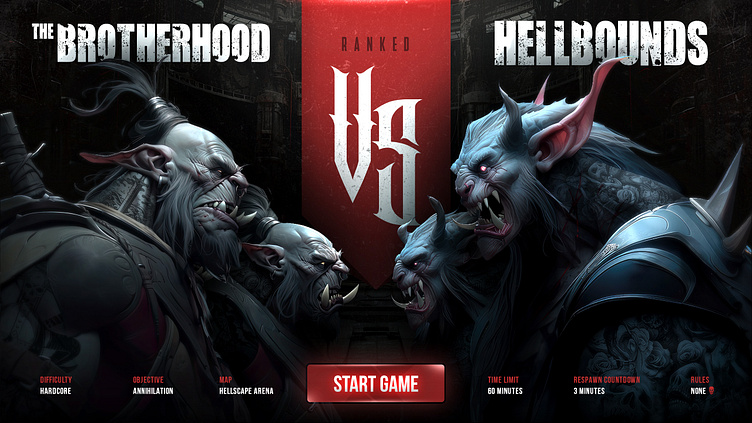
Then, one night, inspiration struck, and I jumped out of bed with a new direction in mind. I transformed the Versus Screen into a striking red canvas with a grunge-inspired setup, a style that resonates deeply with my creative inclinations. The subsequent phase involved adding intricate details and meticulously sifting through hundreds of font choices until I arrived at the result that perfectly matched the image I had envisioned.
This creative process embodies my typical workflow. When asked about the time required for such projects, it's challenging to provide a definitive answer. It unfolds over several days, involving continuous adjustments and refinements until I reach a state of personal satisfaction and artistic perfection.
In summary, this artistic journey reflects my unwavering commitment to dedication, precision, and creative vision, resulting in a Versus Screen that not only showcases my Game UI skills but also embodies my pursuit of artistic excellence.
