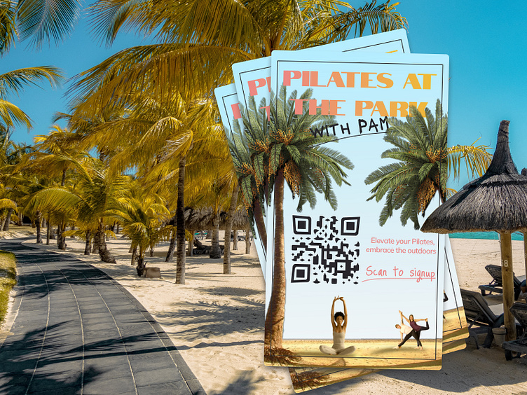
Pilates at the Park with Pam: A Flyer Design Journey
✨ Client's Vision: When the owner of a Pilates studio approached us, they had a clear vision: a fun, inviting flyer that said "Pilates at the Park with Pam!" They envisioned a tranquil park scene with palm trees and silhouettes of people engaged in Pilates.
💡 Our Approach: Designing an effective flyer is more than just aesthetics; it's about understanding how information is absorbed. We carefully considered the flow of information, ensuring that it's not just visually appealing but also user-friendly.
🌟 The Result: Our flyer design brings the park to life with vibrant palm trees and graceful Pilates enthusiasts. To modernize the experience, we integrated a QR code, transforming printed materials into a direct call to action. Now, signing up is quick and effortless.
👉 Why QR Codes Matter: QR codes on printed materials are powerful tools for conversion. They bridge the physical and digital worlds, making engagement seamless.
Ready to elevate your design game?
Let's craft something unforgettable together!


