Polygon x Capx Collaboration Poster
My thought process
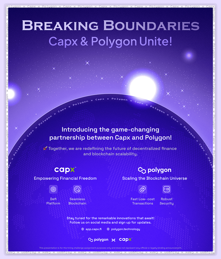
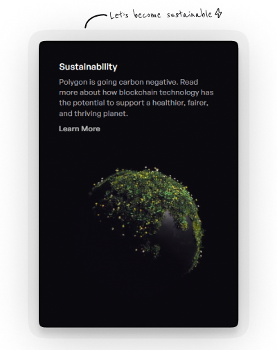
For this poster, I aimed to maintain minimalistic imagery, in line with my usual style, to draw attention to the main focal point. I decided to explore poster design elements that would precisely highlight our deliverables. While seeking inspiration, I discovered that Polygon is actively pursuing sustainability as part of its initiative.
Why this design
What better way to embody these values than through our design? Earth's representation as carbon-free signifies our commitment to a healthier and fairer planet. The rising sun symbolizes the dawn of a new collaboration between CapX and Polygon.
Color system
Initially, I envisioned a chalkboard-styled poster featuring highlights of bright colours like white, blue, and yellow, creating a striking contrast against the dark background. However, after multiple iterations, I concluded that aligning with the brand's colour scheme was a more logical choice. The use of purple signifies the ambition and creativity driving this collaboration.
Connect with me on my socials for more exciting updates and discussions: Threads: @vedant.dzinr Linkedin: @vedant-design Medium: @vedant.dzin
