Dark/Light comparative analysis
Hey dribbblers,
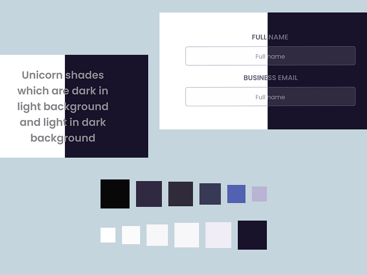
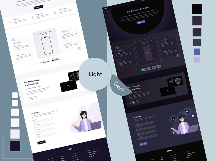
Recently I tried to convert one of my previous design to a dark theme. When we work on the same project in both the themes, we can analyze the pain points because of the colors which users can feel. Also we can find some unicorn shades of grey which can be used for texts in both the themes and easy to read and comfortable to the eyes.