UI Design 101 Portfolio -- Moon: NFT Marketplace App
The Mood
I really wanted to lean into something more edgy after reading the brief, so I gravitated towards a darker UI and wanted to explore interesting font pairings, iconography and moon motifs to tie back to the app's name. But overall, I wanted my design choices to complement the NTFs and keep them as the main focus.
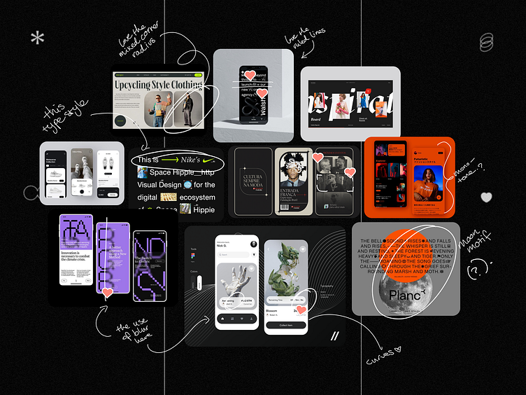
The Mood
I really wanted to lean into something more edgy after reading the brief, so I gravitated towards a darker UI and wanted to explore interesting font pairings, iconography and moon motifs to tie back to the app's name. But overall, I wanted my design choices to complement the NFT's and keep them as the main focus.
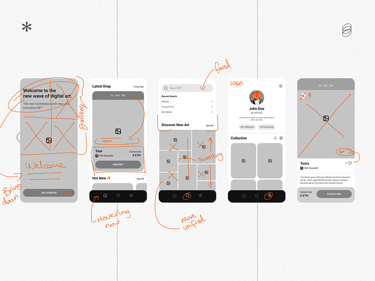
The Process
Pulling apart the client's wireframes
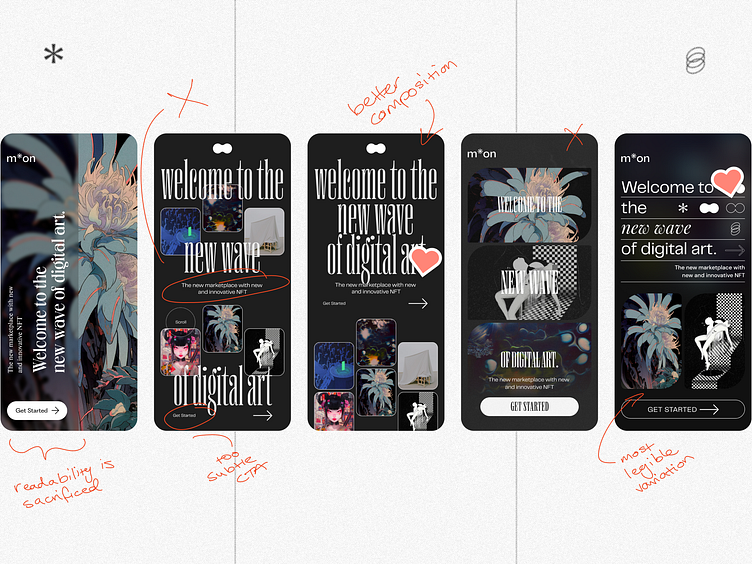
Splash Screen visual exploration -- exploring themes from my mood board.
I ended up moving to a more simplified approach as my early workings favoured aesthetic choices that compromised legibility and user flow.
Creating a hierarchy amongst the multiple touchpoints was a challenge that resulted in me stripping back some of my typographical decisions and opting for balance and a clearer call to action.
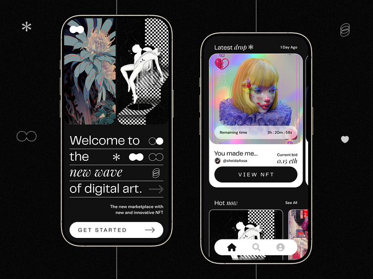
Scaling design across screens -- Once I'd locked down my splash screen, I carried that type styling and line work throughout the rest of my screens. I opted for a black and white colour palette to not compete with the NFTs themselves and round off my corners and buttons to keep consistency across screens.
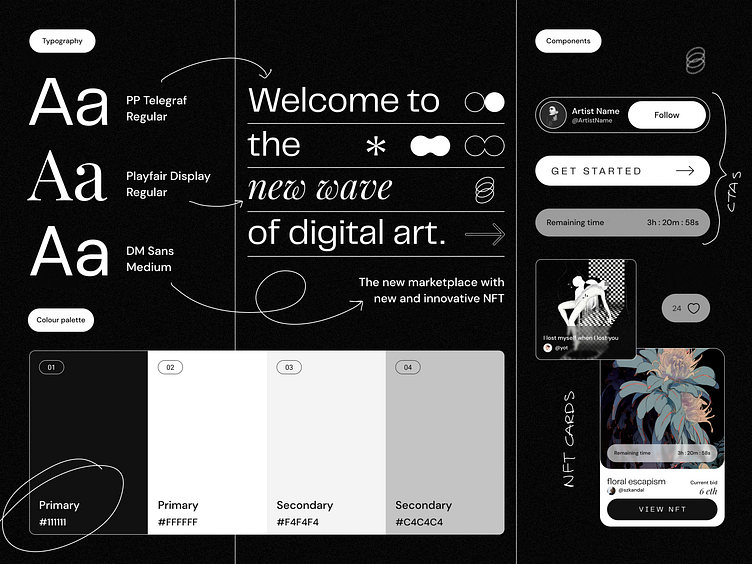
Building out a UI Library
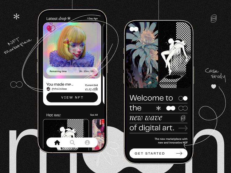
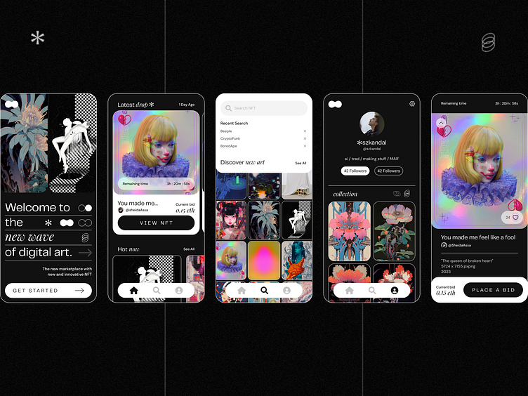
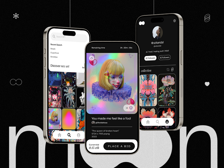
The Final Product
Key Takeaways from the course -- This course really levelled up my scaling abilities in Figma and built up my knowledge around design systems which I was really hoping to achieve. I got a better understanding of component creation and using auto-layout, something I look forward to exploring further in the future.
Final Thoughts
Holding 'option' changed my life forever
