HARMONY WAVE
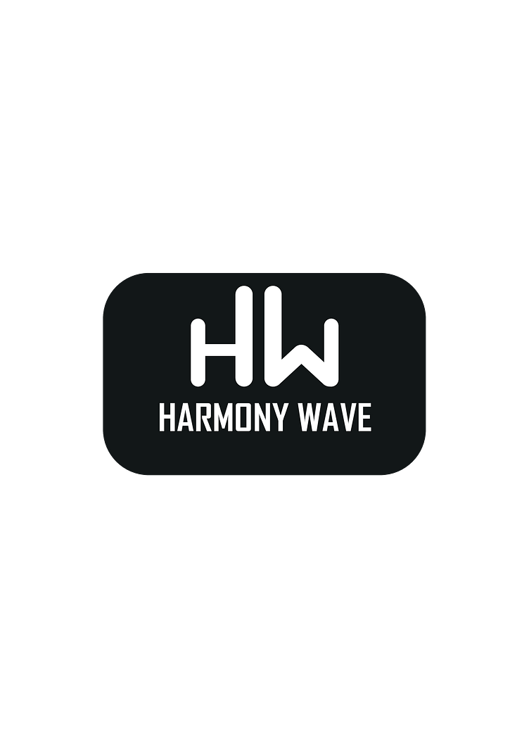
In this concept work, I imagined a brand operating in the music industry. My aim was to reflect the lively atmosphere of the music world in the logo. The letters H and W in white on a black background represent the initials of the brand. The vertical line of the letter H on the right and the line of the letter W on the left represent harmonious working together and a balanced musical production. The brand name written under the letters H and W shows that it emphasizes the identity of the brand. The logo reflects the musical balance and harmony of the "Harmony Wave" brand. The combination of the letters H and W represents the ability to combine different elements and create harmony. The minimalist and balanced design of this logo reflects the professionalism and musical talents of the brand.
Bu konsept çalışmamda müzik sektöründe faaliyet gösteren bir marka hayal ettim. Amacım müzik dünyasının canlı atmosferini logoya yansıtmaktı. Siyah zemin üzerine beyaz renkli H ve W harfleri markanın baş harflerini temsil ediyor. Sağdaki H harfinin dikey çizgisi ve soldaki W harfinin çizgisi, birlikte uyumlu çalışmayı ve dengeli bir müzik üretimini temsil eder. H ve W harflerinin altına yazılan marka adı, markanın kimliğini vurguladığını göstermektedir. Logo, "Harmony Wave" markasının müzikal dengesini ve uyumunu yansıtıyor. H ve W harflerinin birleşimi, farklı unsurları birleştirip uyum yaratma yeteneğini temsil eder. Bu logonun minimalist ve dengeli tasarımı, markanın profesyonelliğini ve müzikal yeteneklerini yansıtıyor.
