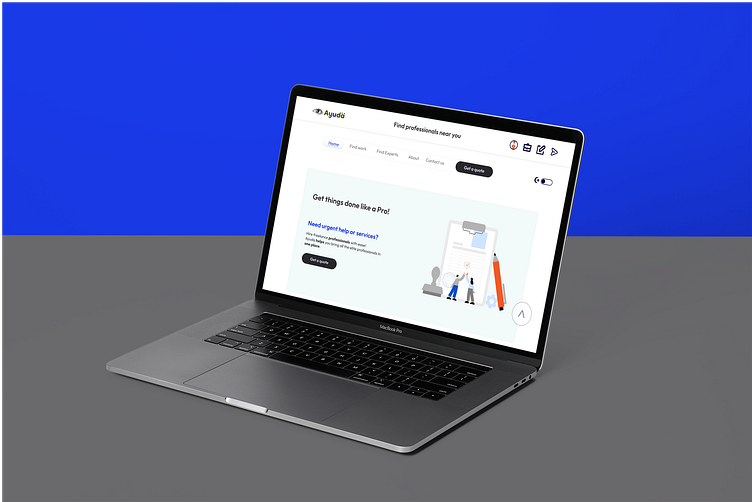
Ayuda website UI redesign: a case study
The problem:
Most online service platforms only allow freelancing and remote services. In the real sense, services should be borderless and not limited to only remote or virtual roles.
Users and clients seeking to hire service providers should prefer to reach out to professionals and get help from the comfort of their homes (whether online or offline), and professionals who are willing to reach out to more clients and offer the services of their skills should be fully equipped to do so with no limit.
The goal:
The goal of Ayuda is to provide an easy-accessed platform where anybody can obtain quick help regarding any issue in life, from professionals from all parts of the world.
My Role and Responsibility
This was a solo project; and as such, I was the Lead Designer and Researcher. I was tasked with responsibility of handling the UX Research, UX design, UX wriritng, etc
The Wireframes and Low Fidelity Prototypes
The Processes and UX research observed
Summary
As a research method, I made a Google Form questionnaire of just 11 questions about what people would expect from an online servicing platform, if they would have the need for one, and what could make them want to. The majority claimed they would most likely visit a professional they know and can confide in.
Here is a link to the moderated questions on Google Workspace forms
User Research: pain points
Value reciprocation
Experts and freelance professionals were concerned about getting value for their money after hiring a professional, and the modalities for a refund and fair settlement if a contract failed.
Hiring right
Clients and online service users were also concerned about hiring the right professionals and the quality of professionals available on the platform.
Data exploitation
Users showed concern about the nature of protection and cloud storage adopted for their data to avoid exploitation.
KYC verification
The processes involved in confirming their identity were perceived as time-consuming by users.
Personas, problem statements and user journey map
Wadi Lisa
Wadi is a science student who needs help to get his science research term paper done because he hates science but needs to make good grades to retain his place on the school team.
Wadi user journey map
Wadi is a promising high schooler who wishes to obtain professional assistance. This user journey map gives an outline of the form Wadi’s journey on the platform could take.
Wadi user flow
Usability study findings
During the unmoderated usability studies, the following were quite common among the participants:
KYC
Participants showed concern about the authenticity of the user’s verification process.
Payment
Participants were interested in the trustworthiness of the method of payment.
Confidentiality
Participants also showed concern about the level of confidentiality that is to be maintained by professionals.
Sparus user journey map
Usability study parameters
Study type:
Unmoderated usability study
Location:
Egypt, Nigeria, remote
Participants:
5 participants
Length:
20-30 minutes
Usability study findings
During the unmoderated usability studies, the following were quite common among the participants:
KYC
Participants showed concern about the authenticity of the user’s verification process.
Payment
Participants were interested in the trustworthiness of the method of payment and gateway.
Confidentiality
Participants also showed concern about the level of confidentiality that is to be maintained by professionals.
High-fidelity prototypes and Mockups
High-fidelity prototypes
Mockup screens
Accessibility considerations
Easy Navigation
The header frame is custom-made for each screen and perceived user, for both a guest user and a recognized user with an account. The frames are made with features that make navigating the platform easy from any page or tab for any kind of user, and also made to stick at the top of every tab.
Also, on each tab, there is a floating button by the right edge that allows for easy navigation to the top page.
Service Reel/carousel
The list of most common professionals has been converted to a reel on a carousel for easy accessibility
24/7 Get Help button
The “Get Help” button is attached to every tab to offer easy access to getting help by bypassing some protocols.
Dark/Light mode screen toggle
Attached to top right corner of every tab for easy accessibility to aid screen mode toggling of choice
Going forward
Impact
AYUDA intends to help users get easy access to professional services from the comfort of wherever they are, as well as to help professionals sell their services to users who are in need of these services. Users can hire professionals and even retain them for future offline services, if within their region, and at the risk of both parties
What I learned
In the course of the research, there are lots of participants who wish they could get handymen at the snap of their fingers without the inconvenience of stepping out of their immediate comfort zone.
Also, usability and accessibility research happen to be the most demanding aspects of design.
Next steps
The design choice and choice of colors are not generally accepted. After subjecting it to the next usability test, considerations may be made towards modifying it.
Considerations for a team of backend developers to make Ayuda a reality.
Brainstorming on the choice of cloud storage for user data and the method or mode of payment
Hire me
I'm available for a role. You can contact me, check out my portfolio site or hire me for entry-level opportunities via
📞 +2348136191067
Thank you for staying with me!


