UI CONCEPT - Landing the Athlete's Site
Attractive and distinct design
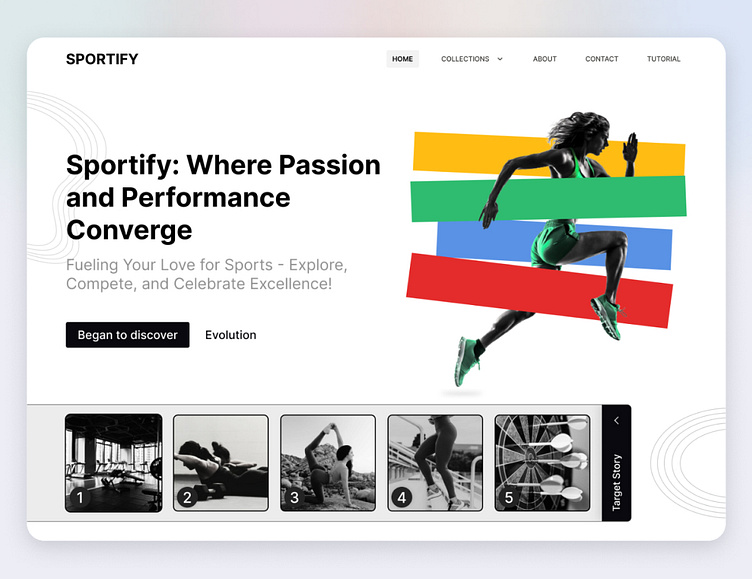
In this design I used the image with a few color shapes around the athlete's image.
In the lower part of the story section, I put the athlete's targeting in two stages (this section seemed new for myself, so I put it so that the user would get acquainted with the athlete's growth process and see where it came from)
More by mehrdad ghadermarzi View profile
Like
