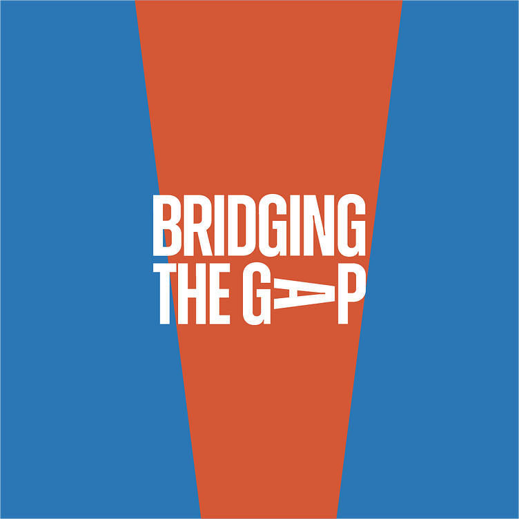
Bridging The Gap Visual Identity
Bridging The Gap
Bridging The Gap is a non-governmental organization that aims to foster a connection and build a relationship between the different classes in the society.
The Goal was to create a bold and vibrant identity that is easily recognizable.
Logo Idea - A bold wordmark was chosen for easy identification. The idea was to make it as simple as possible and still communicate the main idea of the brand at a glance. This was achieved by the letter 'GAP' which is a space as the word implies. The letter 'A' was represented as a form of a 'bridge' which connects the space between the two points i.e letters 'G' and 'P'. This represents the main idea of the brand, bridging the gap in the society.
Colour Palette - A vibrant colour Palette was chosen based on the brand values for easy identification, hereby grabbing people's attention.
Currently open to commissions!
(Brand Identity, Logo Design, Packaging, Merch, Pitch Deck, Iconography, Posters)
Email: olatunjiakinwande75@gmail.com
LinkedIn: https://www.linkedin.com/in/davzoid030104
Twitter: https://twitter.com/dav_zoid


