Moon: NFT App Case Study
Introduction and brief
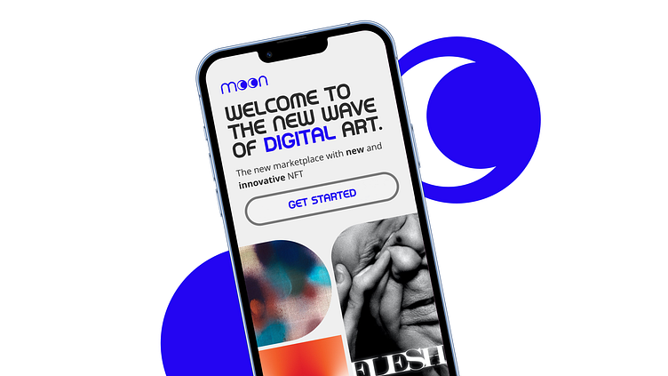
In the world of digital art and NFTs, there's a startup called Moon that's trying to shake up the NFT marketplace by focusing on design and user experience. This case study takes a closer look at Moon's efforts to create a unique visual identity for its NFT marketplace app, which has the potential to change the digital art landscape. My aim was to develop a flexible design based on wireframes provided by the client, resulting in a comprehensive UI library and a prototype that aims to set new industry benchmarks.
Deliverables
New visual language for Dig/Art
Fully designed flow in High Fidelity
UI library
Functional Figma Prototype
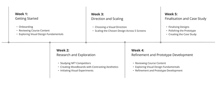
Timelines
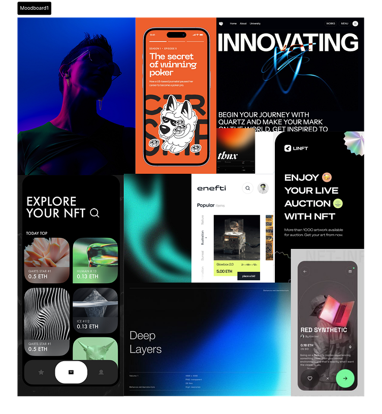
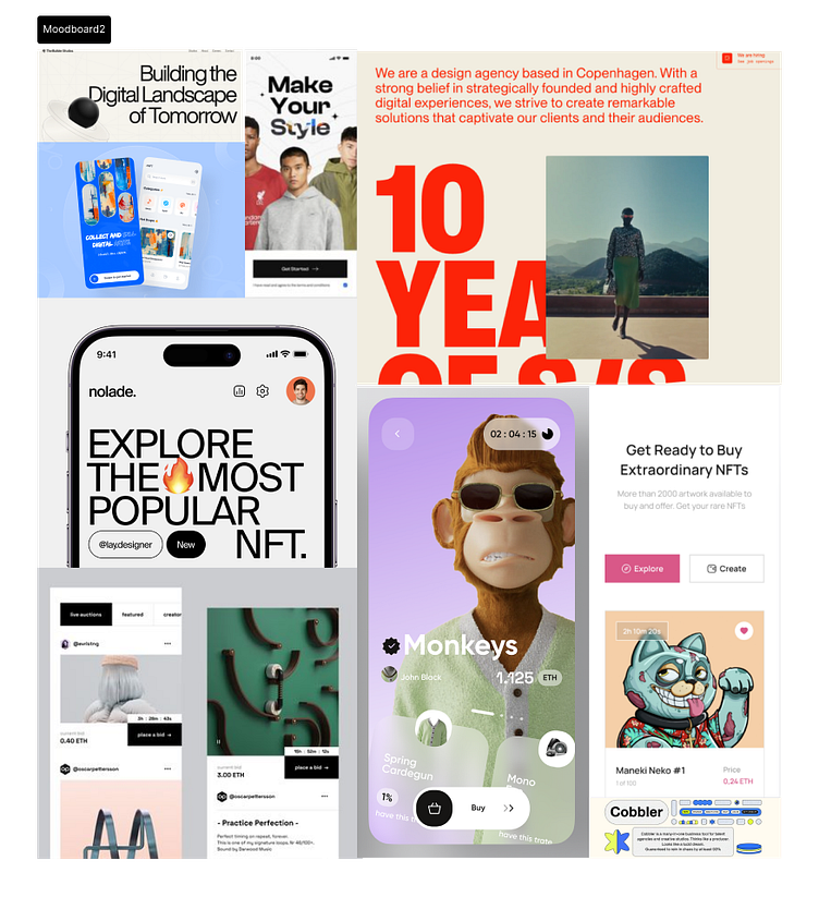
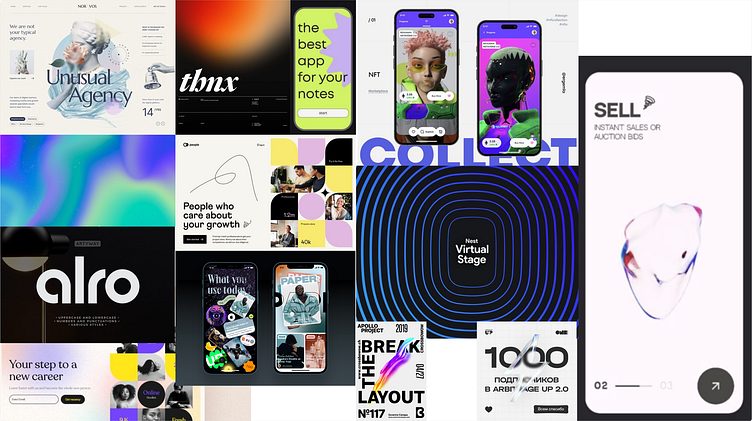
Moodboards
Visual Research Process: For the visual research phase, I leveraged platforms such as Pinterest and Dribbble as my primary sources of inspiration. To initiate the process, I began by immersing myself in the NFT landscape and mainstream design aesthetics.
To start the ideation phase, I made two mood boards - one with dark themes and the other with lighter aesthetics. During a mentor session, I brainstormed with a group of peers and got their input, which helped me refine my vision. Together, we picked the most inspiring images and used them to guide the project.
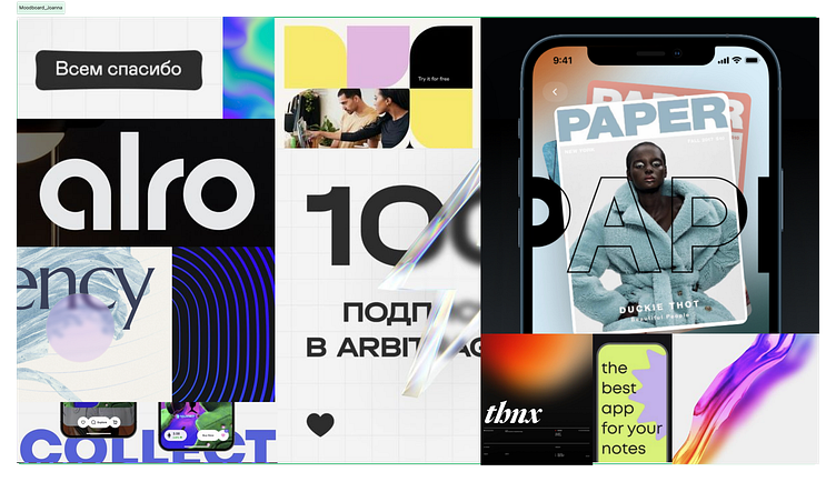
Results:
two mockups for dark and light motive
one mockup with my favourite inspirations
final mockup with favourite selections
First design drafts
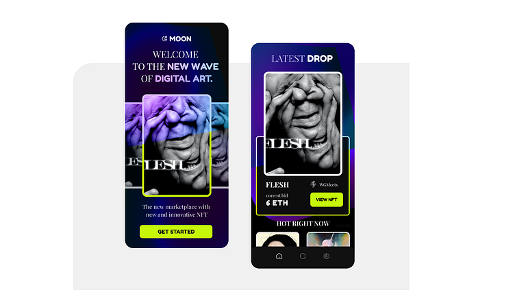
The final call on visual direction
Accessibility Focus: The decision to move away from the dark, futuristic theme was driven by a commitment to accessibility, as such themes can pose usability challenges. Additionally, the market is saturated with similar concepts.
Distinctive Branding: Avoiding an overt space theme aligns with the 'Moon' brand's identity, striking a balance between subtly referencing space and standing out from the competition.
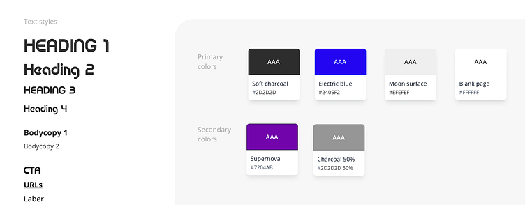
NFT Emphasis: The chosen concept prioritizes highlighting NFTs themselves, opting for a minimalist approach that relies on a 10 px grid, 5 columns, and geometric shapes for a clean and user-friendly design.
Typography Balance: The selection of Alro font, supported by Open Sans, strikes a balance between visual appeal and solid typographic principles, enhancing the overall UI's aesthetic and functionality.
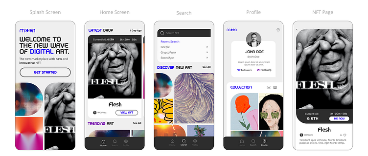
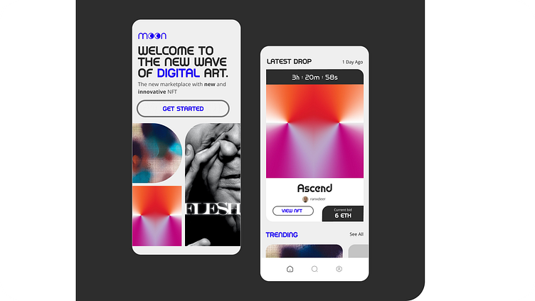
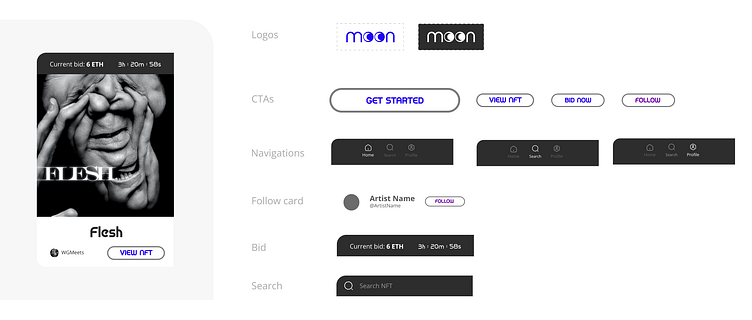
Design system and prototype
Key takeaways
These key takeaways emphasize the practical skills and insights gained from the course and project, underlining their critical role in achieving project objectives. The lessons learned highlight the importance of:
Design Testing & Improvement: I utilized Figma plugins to improve the design elements and make them more user-friendly.
Effective Time Management: Mentor sessions helped me understand the importance of structured time management to consistently meet project deadlines.
Embracing Creativity: I explored creative solutions such as simplifying the colour palette to enhance the visual impact of NFTs and align with project goals.
Design Documentation's Value: I realized the value of comprehensive design documentation in scaling the design and saving valuable time.
Dedication & Structure: I want to acknowledge the dedication and structured work approach that went into the project, which is reflected in both the process and the quality of the results achieved.
I feel really lucky to have had Balazs as my mentor and to have worked alongside such an awesome team.
Our use of NFTs from foundation.app allowed us to showcase the immense talent of the artists behind them.
