Rediscovering Paytm: A Simplified Experience

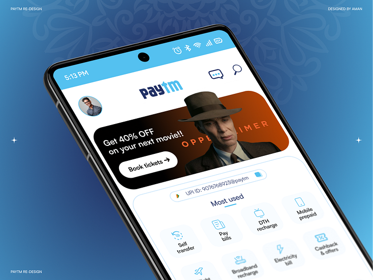
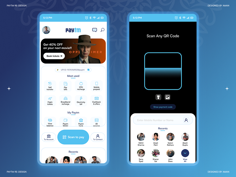
Let's get real here, folks! When it comes to UPI apps, I am a loyal GPay user, too afraid to even open up Paytm. Why, you ask? Well, it's all about that chaotic, cluttered UI. It's like everything's battling for your attention, especially that sneaky "Scan QR" button. Using it felt like a full-on treasure hunt just to make a simple payment! So, I decided to take things into my own hands and gave the Paytm app a redesign with user centric design approach.
It is all about simplicity. The "Scan QR" button shines, navigation is streamlined with a handy scrollable card displaying main info and your top apps, and your favorites are just a tap away. It's not just functional; it looks great too. Say goodbye to confusion and hello to a Paytm that makes payments a breeze!
(Disclaimer: This redesign is a concept and not an official Paytm release. The design and features mentioned here are fictional and created for illustrative purposes.)
Feel free to reach out: