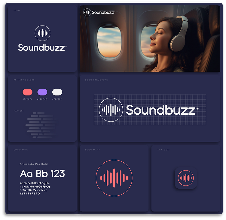
Design Portfolio: Behind the Creation of Soundbuzz's New Emblem
My Journey Crafting Soundbuzz's New Emblem: How I Married Sound and Vision
Hey folks, I'm super thrilled to lift the curtain on one of my latest gigs—designing the snazzy new emblem for Soundbuzz! You know, the place where your eardrums go to party. 🎧
The Eureka Moment
Man, when I first got my hands on this project, I was like a kid in a candy store. Imagine trying to bottle the magic of music into a visual format. To get the creative juices flowing, I dived headfirst into the colorful world of musical genres and even spent hours tinkering with different audio platforms—anything to get that lightbulb moment, you know?
The Color Saga
Choosing the color palette was no walk in the park, let me tell you. I needed shades that would sing—not just to the Soundbuzz die-hards but also to those just passing by. After a ton of trial and error (and a few sleepless nights), I struck gold—a combo that's as dynamic and diverse as a killer playlist.
Techy Talk
Alright, so here's where my inner geek had a field day. Armed with my trusty Adobe Illustrator and Sketch, I crafted this baby to look good on any screen size. You bet I did some A/B testing; I wanted this emblem to rock, whether you're squinting at it on your phone or gawking at a billboard.
The Big Reveal
What you see now is more than just a logo; it's a love letter to music. I'm darn proud of how it turned out, and I can't wait for you to see how it elevates the whole Soundbuzz vibe.
