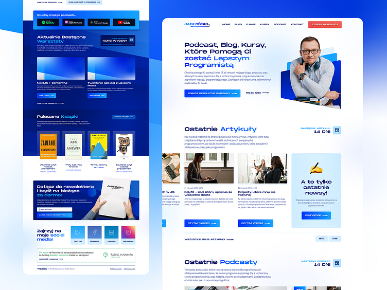
Personal site design for IT developer and podcaster
From the 2021 Mateusz wants to redesign his brand and he came to me. He had a black and red site looking like basic wordpress theme and need to change it to build better personal brand.
Mateusz is a not typical cave-type programmer.
He is very active in many initiatives, workshops with good sense of humour. He make monthly podcasts and discuss about IT.
We start from the logo - it is a basic concept, his surname and return/enter symbol - daily association with programmers job (how often they pressed that button a day? i don't know :D)
A quite refreshing is the make the symbol with a gradient. We choose blue intentionally, for the opposite to old brand.
And the little touch is a make a arrow icon to the buttons from the logo clearly
This is a core for his site. The article layout. The main goal was a make a layout which he could add or remove extras elements like podcast or books without crashing reading line.


