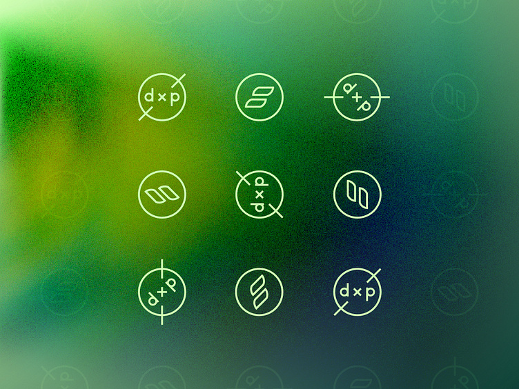
DXP Rebrand
At Showit, we host a Design Experience that we like to call "DXP" for our Design Partners. When I joined on board, a big need was to identify moments where the brand could be strengthened. Prior to this rebrand, the previous DXP logo was in all caps and had quite a few extra details included, such as the year, state, country, and "Designer Experience." I stripped all of that back to the basics and really allowed the less is more mentality to set the precedent. Normally, we wouldn't advise rotating a logo, but because I strategically custom made the letters to be lowercase, it allowed the end result to be a perfect mirror reflection and create a seamless rotation. And we now rotate it on a loop for our DXP page! So here we are having a little fun by breaking the rules and rotating all the things.
