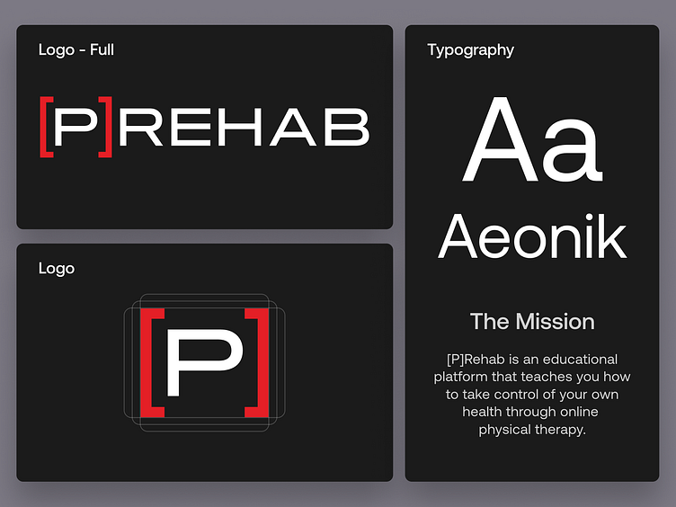
[P]rehab: Design System
The Client
[P]rehab is a team of world renown Doctors of Physical Therapy & Certified Strength Coaches dedicated to helping you take control of your health with exercise & education from the palm of your hand.
The Challenge
[P]rehab had a black and red color theme picked out from the jump. In our collaboration, we used those colors to expand their brand style guide. The black and red color theme has a sharp feel to it, which pairs along nicely with their workout themed product. We wanted to stretch that feeling out through their entire brand
The Solution
We chose aeonik as their brand font because it suits the sharp workout theme we wanted displayed across their brand. We created simple workout themed iconography that follows [P]rehab’s primary color palette. These icons can be seen throughout their app, which allows for the theme we wanted to be reinforced everywhere they appear.
We are thankful that [P]rehab allowed us to work on their design system!
Who is Caviar?
Caviar is a design agency dedicated to helping clients bring their visions to life. We specialize in a variety of design skills including, but not limited to: UI, Web Design, Mobile Design, Illustrations, and Product Design. Our motto is “Building brands, websites and experiences” we take pride in making sure that Caviar is an agency that not only gives high-quality designs but high-quality experiences.
Check us out at https://eatcaviar.co


