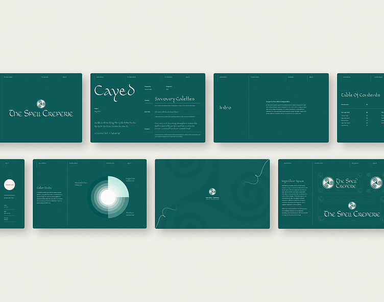
The Spell Creperie • Branding
About the Brand
Founded in 2015, Spell Crêperie introduced the authentic flavors of France to Bali with a variety of savory galettes and sweet crêpes made from fresh ingredients and authentic recipes. The restaurant’s decor evokes the magic and mystery of Brittany with traditional artwork, warm lighting, and wooden furniture. Their mission is to transport customers to a land of fantasy, creating a magical and delicious experience.
Project Brief
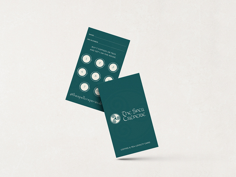
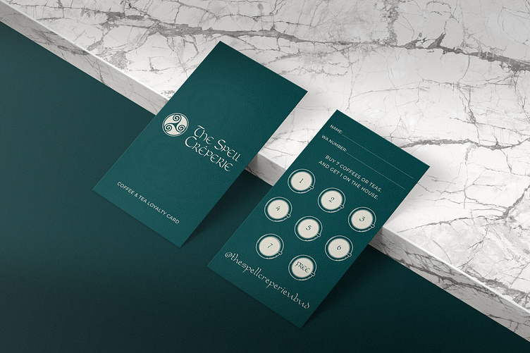
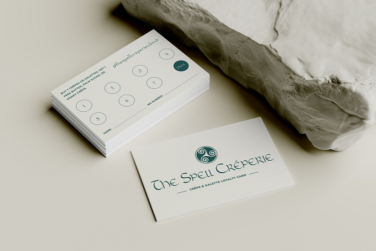
They needed a team capable of translating their unique and magical atmosphere into an inviting brand identity. They wanted a visual identity that genuinely captured the charm and coziness of the restaurant's atmosphere, while also reflecting the authenticity of its cuisine inspired by Brittany. The project involved creating a comprehensive visual brand identity, and two different loyalty card designs.
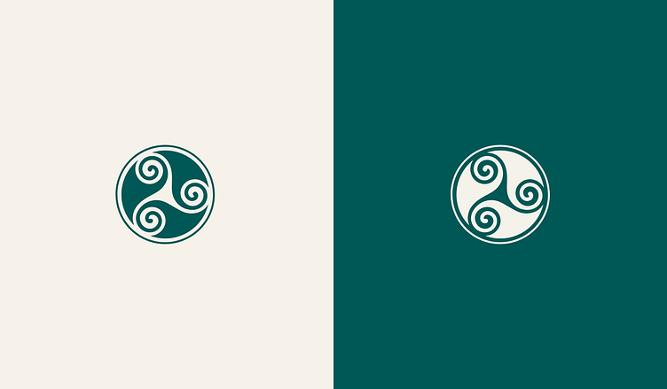

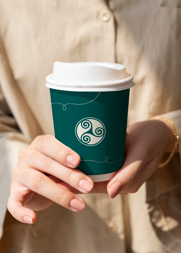
The Logo
We created a logo that struck a balance between cleanliness and artistry, resulting in a unique and memorable design. The logo utilized a Celtic typeface inspired by ancient Gaelic scripts, lending a sense of tradition, history, and culture.
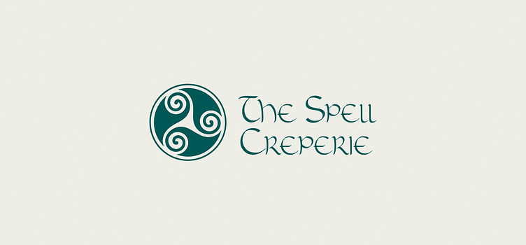
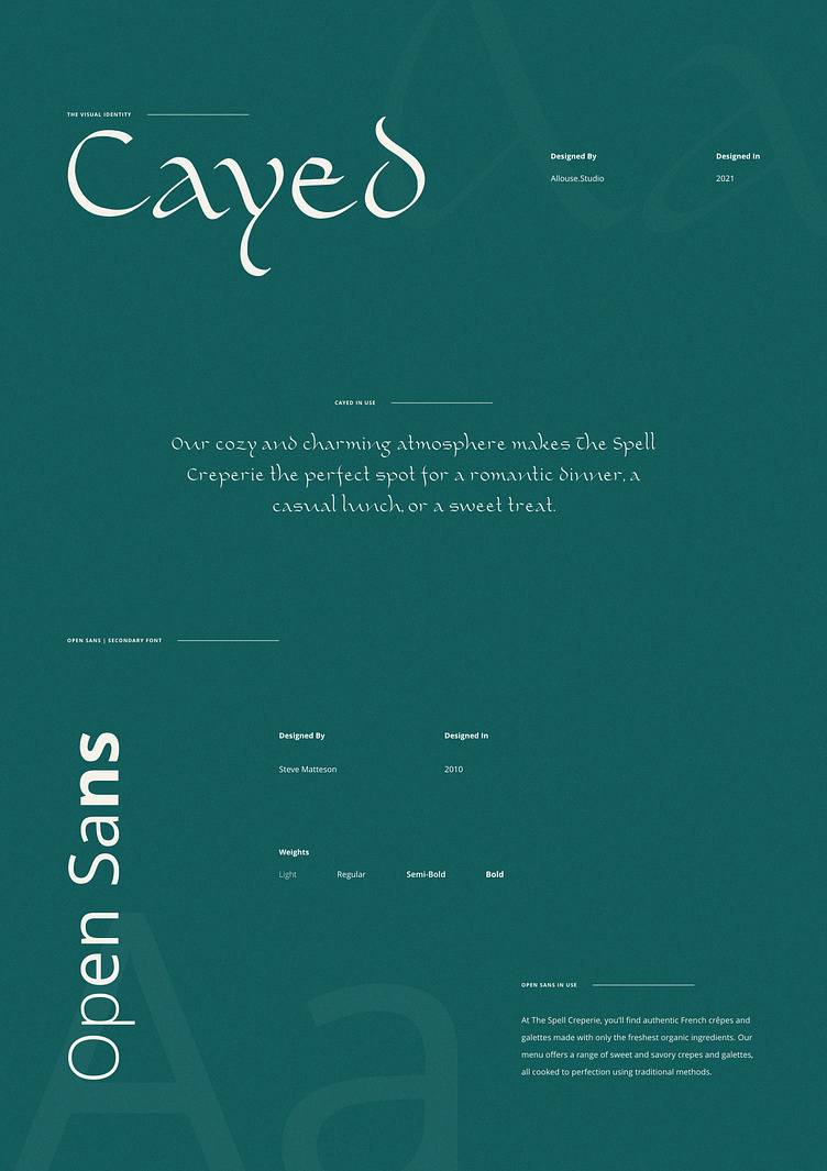
The Typography
The typography needed to strike a balance between artistic modernity and a hint of ancient culture. Following extensive discussions and revisions, a retro-stylish font inspired by ancient Gaelic scripts was chosen as the primary font, complemented by a basic sans-serif font to create a sense of harmony and balance.
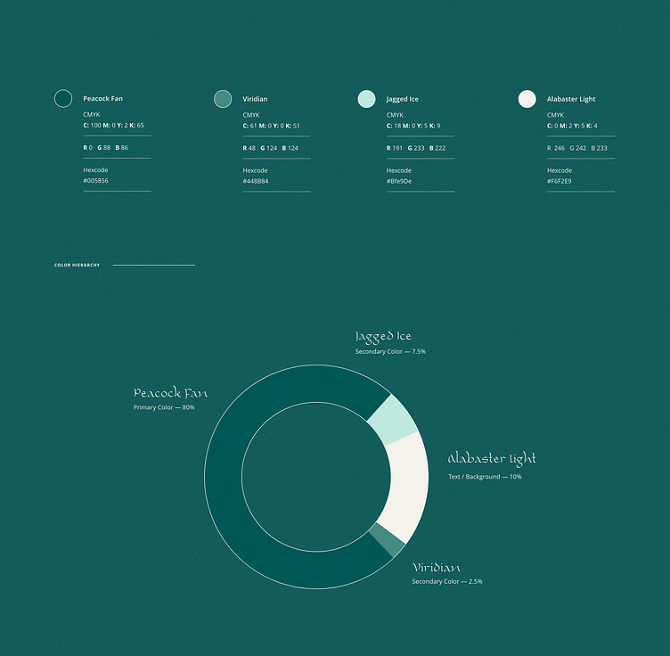
The Color Palette
We put a great deal of thought into creating a color palette that would be both modern and approachable. After carefully evaluating various options, we ultimately settled on a curated selection of three colors: two green-blue hues and a warm beige shade. The combination of these colors produces a calming and captivating ambiance that beautifully complements the personality of the crêperie.