3D Touch Revised Facebook
Dello Dribblers, people these day are spending lots of time to using Facebook, that’s why the minor change of the app will be a big change for User Experience.
This is a revised Facebook base on my personal needs and experiences. Perhaps it’s not familiar with your behavior but feel free to let me know what you think. I also not tested 3D Touch yet.
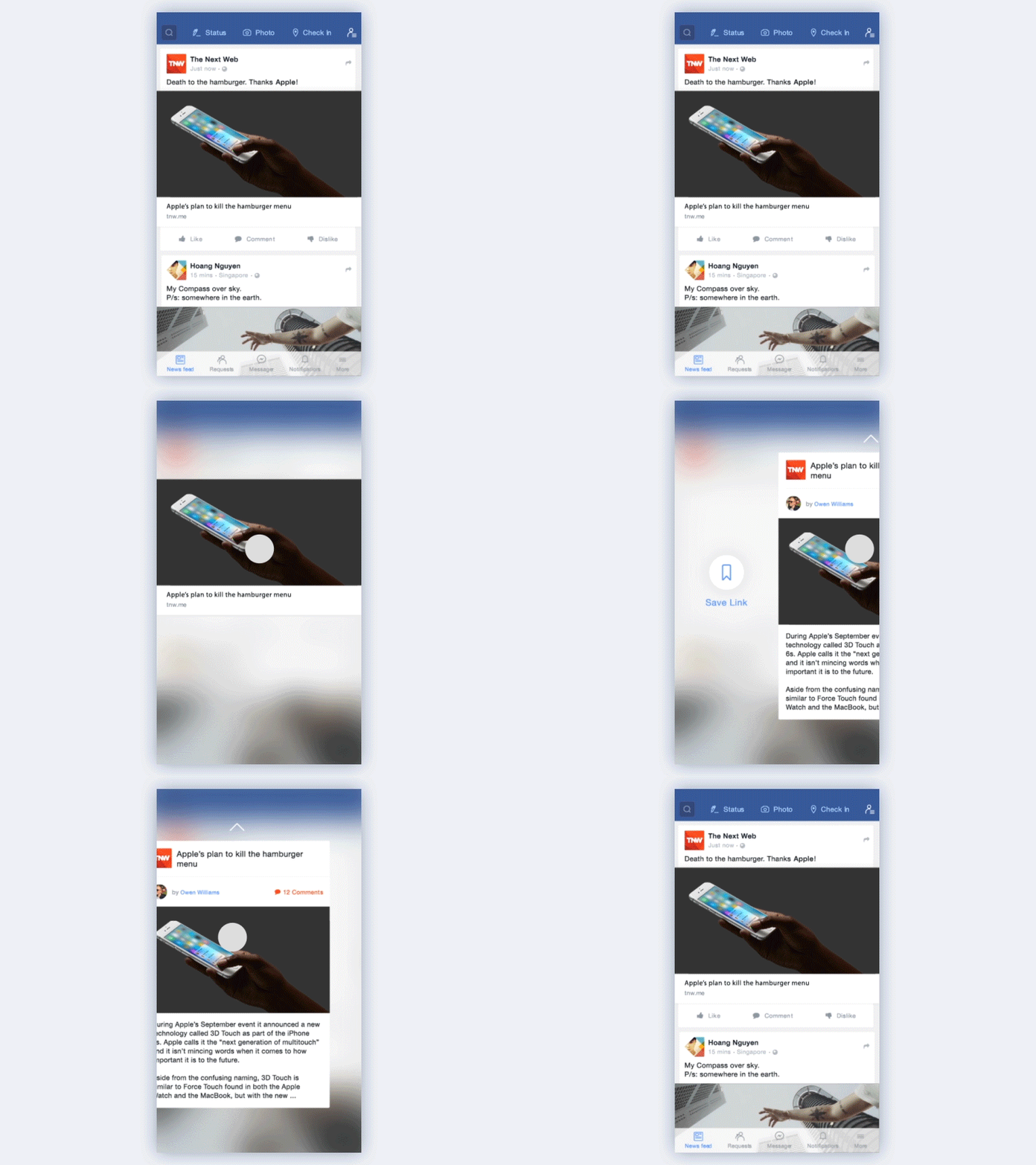
Besides the change of UI (cleaner and nicer in my opinion), there are some other changes listed below:
• Move 3 post functions “Status” - “Photo” - “Check In” to header bar, scale down search bar to create more space for news feed.
• Swipe left to active Search Screen. Because my need for searching is not so much.
• C.E.O Facebook Mark Zuckerberg announced that they are developing "Dislike" button. I think it is best suited to stand opposite the "Like" button. Regarding the priority of “Comment” and “Share”, I decided to move “Share” button above the post, and use 3D Touch to replace dropdown menu.
Please take a look on this interactive prototype then leave your feedbacks or view attachment to see full screens on pixel. Listening to your thoughts will help me improve a a lot.
Thanks Facebook to make the world closer.
Thanks for watching my work and if you like it, please follow my Dribbble | Behance


