Amazon Sign In Redesign #2


I'm a huge fan of Amazon and a loyal user, it's really tough to beat the convenience of being a Prime member. Recently, Amazon has started rolling out aesthetic and UX-based changes to their site – in many cases improving the experience and bringing a more contemporary feel to the site. But there's one place in particular that has been neglected – the sign in / sign up screen.
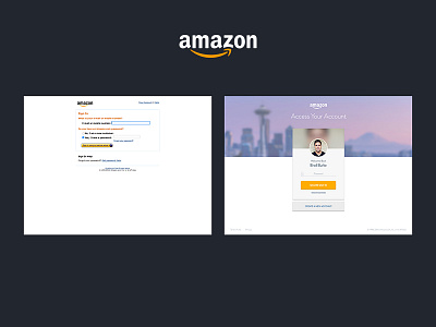
Now, one could argue that their current sign up page is functional and 'if it ain't broke, don't fix it' – but that doesn't mean other solutions couldn't be explored. Even something as subject as a light reskin or changes based purely on visual appearance can drastically improve performance. I'm of the mindset that everything should be considered, even when the content or functionality seems very minimal.
As a purely experimental, personal project, I have mocked up a few potential solutions that give alternate looks to Amazon's current sign in page. These are purely static comps and the use of motion could bring these ideas to life with even more fidelity.
Be sure to check out the full size images for a better look and check out the other options in the series.
Feedback always welcome.
#1 - https://dribbble.com/shots/2255989-Amazon-Sign-In-Redesign-1
#3 - https://dribbble.com/shots/2256031-Amazon-Sign-In-Redesign-3