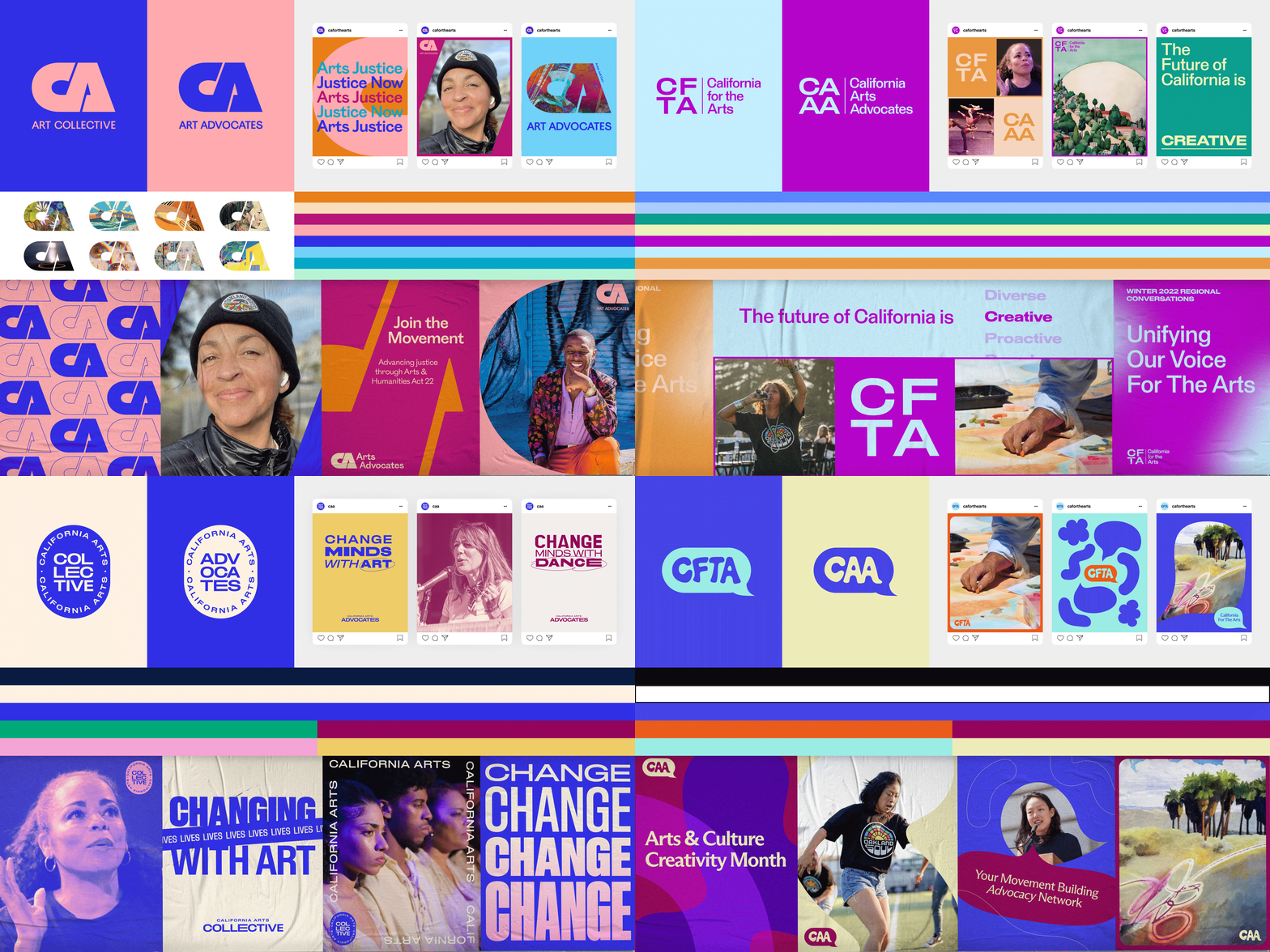
Unused Brand Directions – CA Arts
As much as I love seeing the final visuals for a branding project come to fruition, I also very much enjoy the in-between exploration stages of strategic positioning and creative concepting.
We pitched these four drastically distinct visual brand worlds (in addition to the winning direction) to the client. These are the ones that did not make it to the finish line.
﹏﹏﹏﹏﹏﹏﹏﹏﹏﹏﹏﹏﹏﹏﹏﹏﹏﹏﹏
➊ Marking California
Art is the lens through which we experience our surroundings, and can change the way we see the world. To communicate that, this direction utilizes a bold monogram “CA” as a window to showcase artists’ work, and make a bold and identifiable mark for California Arts.
➋ Creatives Stand In Solidarity
CA Arts Network and CA Arts Advocates are technically two different organizations. But in practice, they function more as one. We position the two brands’ names as acronyms, and stack them like blocks in an organized fashion to help our audiences associate them as interconnected. We also bring in lines to represent stability and solidarity, and help organize information and lead the eye to what’s important.
➌ Badge of the Arts
When people feel connected to a cause, they want to wear it like a badge.
In this direction, the logo resembles a badge, like a stamp of approval or official government business, but with a creative twist. We make use of variable fonts to convey motion and creativity. And combine it with a bold and modern typeface that easily translates to the rest of the brand applications.
➍ Speaking Up About the Arts
Their mission to end the paradigm of the starving artist starts with awareness and speaking up. This direction uses uniquely shaped speech bubbles to represent advocating for, and giving a voice to, underserved & underrepresented communities and artists. We use a graphic library of both speech bubbles and organic shapes to represent all the marks artists leave in the world when they’re uplifted and heard. The organic nature of all the shapes ties back to an artisanal, hand-made look and feel.


