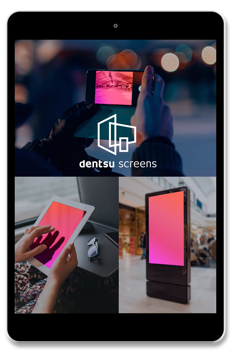
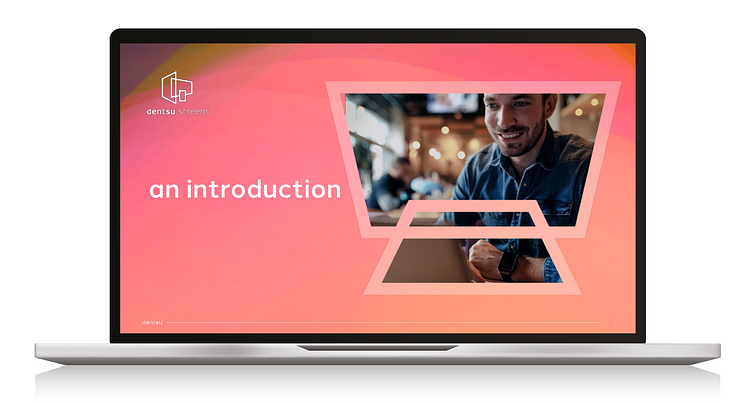
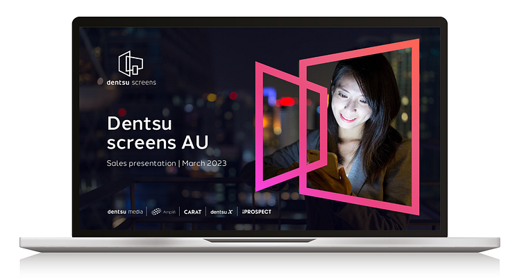
dentsu Screens
CHALLENGE
dentsu
Digital screens
A new B2B digital product requires a new product visual identity! The product name is “dentsu screens” and the objective is to create a design that effectively conveys the product’s functionality while standing out among other similar (but very different) dentsu media products existing in the digital media landscape.
SOLUTION
dentsu screens
several icon concepts were created to embody the concepts of Alignment, Synchronization, and Synergy, representing the connected digital universe that the product offered. Five distinctive routes were developed, each with its own style and accompanied by a matching strapline. This approach provided a range of design options that were visually compelling and unique, ensuring the product’s distinguishability.
ROLE
Art direction / Branding & VI / Concept / Design & layout / Illustration / Copywriting / Finished artwork
Concepting
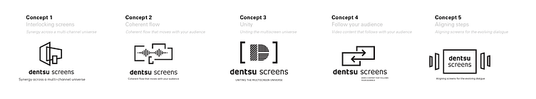
Brainingstorming produced 5 contrasting concepts with accompanying straplines. These were then paired with basic icon symbols to capture the essence of each:
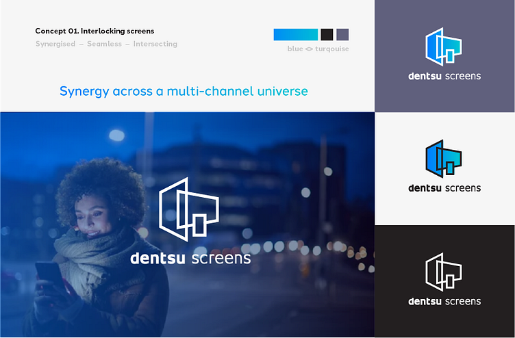
CONCEPT 1: Interlocking screens – Synergy across a multi-channel universe
CONCEPT 2: Coherent flow – Coherent flow that moves with your audience
CONCEPT 3: Unity – Uniting the multiscreen universe
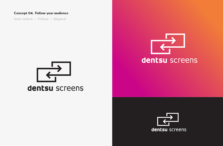
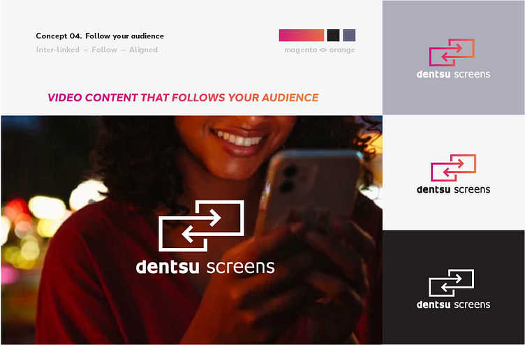
CONCEPT 4: Follow your audience – Video content that follows with your audience
CONCEPT 5: Aligning steps – Aligning screens for the evolving dialogue
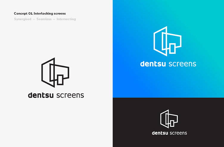
Here are concept development boards for some of the concept routes.
Concept 01.
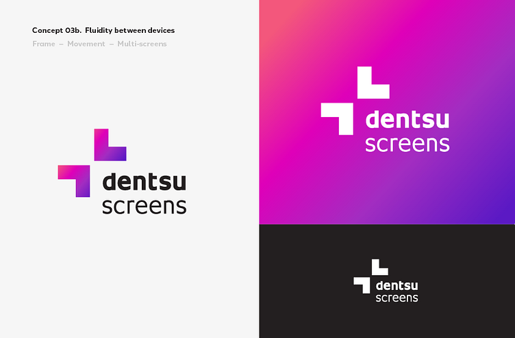
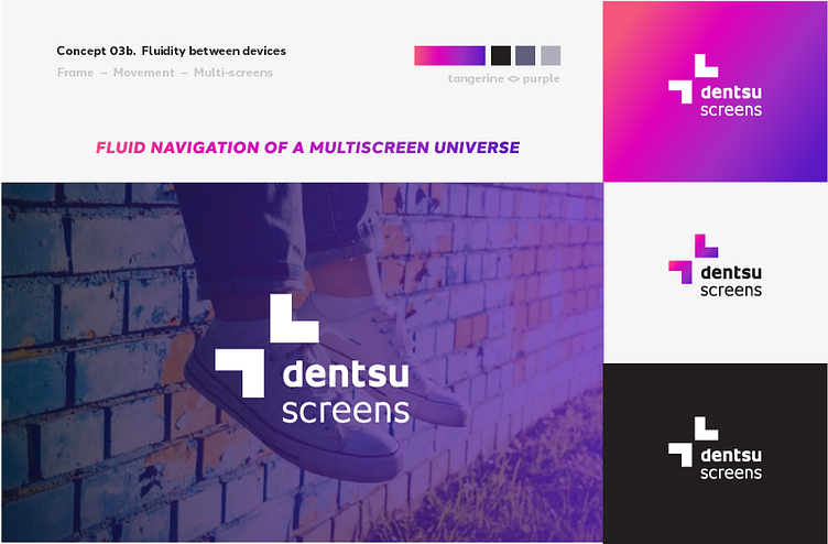
Concept 03b.
Concept 04.
Chosen route - Option 1
The client felt that the clear winner was concept 1 – as the interlocking screen depicted the varied nature of viewing platforms. They chose to switch the colour ways with Concept 4 which used a tangerine /magenta gradient for a stronger, more vibrant identity.