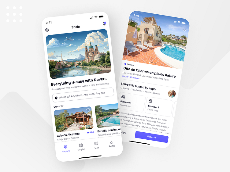
Concept Design for an Airbnb-like Vacation Rental App
Hello, Dribbblers! 👋
We're thrilled to present our latest design concept for an intuitive Airbnb-like vacation rental app! This design stands out from the start, with users choosing a destination and being greeted by a landscape cover specifically designed for that chosen location. The homepage highlights a curated selection of nearby accommodations, streamlining the decision-making process. Each accommodation reveals a detailed page filled with essential information - from room count, visitor capacity, reviews, star ratings, and even a 'verified host' feature for extra peace of mind. A simple tap on the heart icon allows users to add appealing accommodations to their favorites list effortlessly.
But the ease doesn't stop there! A well-placed 'Reserve' button on the detail page guides users to the 'My Plan' area. This section is a marvel of design simplicity, carefully organizing all reservation details - current, past, or future - into one unified space. The layout enhances accessibility, making it easy for users to revisit memorable past stays or glance at upcoming travel plans. It's the kind of thoughtful design that puts everything users might need right at their fingertips.
We're buzzing to hear your thoughts! Drop us your feedback, and keep an eye out for more exciting updates! 🌍✈️ Follow us 👈
See more projects on Behance
Let’s get in touch: Atolye15 | Instagram
We’re available for new projects!
Tell us more at hello@atolye15.com
Take care! 😎🤘

