Personal logo
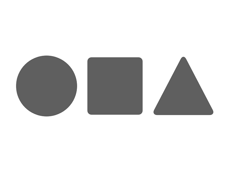
After some initial hand drawn sketches, I settled for this variant where the letters in my name are represented by some basic geometric shapes.
These geometric shapes are the basic building blocks that almost all visual designs can be built upon. This is a nice symbolic touch that fits well with my profession as a web creator.
I will use optical adjustments instead of relying to pixels and metrics. If it looks good, then it is good, even if it's a few pixels off. But it will take some time to get the sizes and spacings right. This is the first version, but definitely not the last one.
Let me know if you find something I can improve.