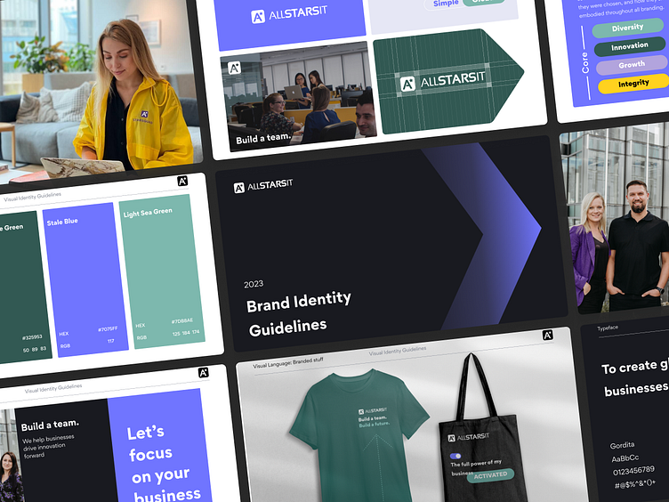
ALLSTARSIT Brand Guidelines Redesign, Guide Identity Book
Hey!
I'm thrilled to unveil the revamped Brand Book for ALLSTARSIT — tech company for comprehensive solution for hiring, compensating, and supporting remote employees worldwide.
The Primary Challenge
Shifting the Focus from Candidate Hiring to Client Engagement
The company's branding, originally established in 2021, primarily emphasized the recruitment of candidates for open positions. It featured vibrant colors, numerous elements, and purple as the primary color, symbolizing a friendly work environment, employee benefits, and synergy.
In 2023, the company's direction evolved towards engaging potential clients and enhancing connections with current ones. The new primary color, green, was chosen to convey notions of growth, trustworthiness, and maturity. The overall design has been simplified and streamlined, giving the brand a more global and sophisticated appearance.
My Scope of Services
Logo improvement
Visual Guidelines
Visual Language Communication
Merch Design
Overview
Thank you for the opportunity to share this exciting journey of shaping ALLSTARSIT's brand identity. Each element has been thoughtfully designed to reflect the core values and spirit of the company, ensuring a lasting impact on clients and partners.
Press ❤️ if you like my design, and share your feedback!
I'm available for full-time or freelance work
Linkedin | Behance | Instagram
Email: sobolanua@gmail.com


