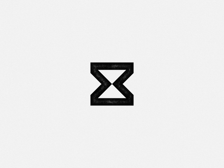
Pantheon Labs — unused concept
unused brand identity mark concept created for Pantheon Labs — a venture studio that solves problems through partnerships
—
This concept was inspired by the continuous, back-and-forth flow of knowledge and resources — the give-and-give — that is central to the kind of true partnerships Pantheon Labs seeks to form. The hourglass shape is functionally symbolic of this back-and-forth flow, and when rendered as a flat/abstract graphic it also has a scientific feel, tying into the “Labs” component of the name. When further dissected, you see two arrows pointing toward each other and meeting at the center, perfectly balanced.
—
See case study here and the selected/final design direction here
More by Amy Nortman Holcomb View profile
Like
