Hauk Skylight Branding Project
The Hauk Branding Design project aimed to encapsulate the essence of a groundbreaking new product— a composite roof panel that discreetly hides and protects satellite dishes. The innovative panel ensures that the technological appendages are seamlessly integrated into the home, without compromising on aesthetics or functionality.
Concept
The challenge lay in creating a visual language that would aptly represent the dual functionality of the roof panel— both as a protector and an aesthetic enhancer. Inspired by the hawk, a bird of prey known for its keen eyesight and hunting skills, the branding seeks to convey a sense of vigilant protection.
Logo Design
The centerpiece of this branding design is the logo, ingeniously crafted to represent a hawk's wing while doubling as a stylized roof. The wing represents freedom, high vision, and security, while the roof element grounds it as a home-related product. Together, they encapsulate the harmony of aesthetics and function that the HawkWing Roof Panel provides.
Color Palette and Typography
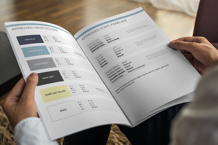
The color palette was carefully chosen to include hues of blue and gray, and yellow, alluding to both the sky and the solidity of a home structure. The typography is modern and sleek, complementing the design elements and creating a unified visual message.
Deliverables
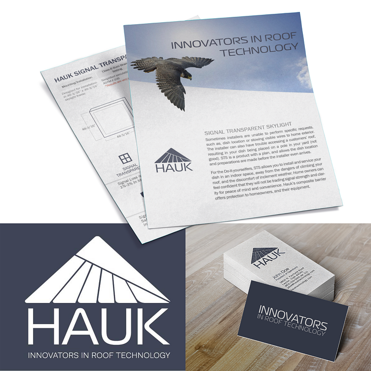
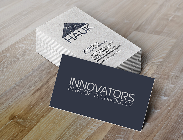
Logo Design: A dual-symbolic logo capturing the essence of protection and home aesthetics.
Brand Guidelines: Detailed documentation outlining logo usage, color codes, and typography.
Marketing Collaterals: Business cards, letterheads, and flyers, all encapsulating the brand's unique identity.