Daily UI - Credit Card Checkout
I tried something similar to what's usually provided in apps nowadays. A few things to note:
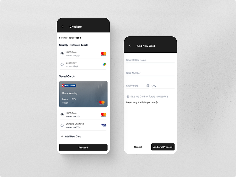
In the add card form, I have given both back and cancel which although acts similarly aids both types of users who are comfortable with using either.
It is always a good practice in such scenarios to make Cancel as a ghost button or link button/text button as we don't want the user to "not do it"
Although It's not necessary to show the entire list, giving a glimpse of order details like the number of items and total would be good.
#DailyUI