Configurator popup
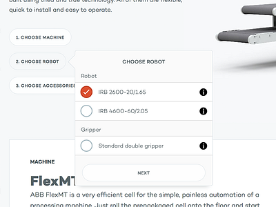
Actual screenshot of a robot cell configurator I'm building. A lot of options had to be squeezed into a small and user friendly ui, and a popup for all options turned out to be the best approach. It translates well to smaller screens too.
One thing I have not yet decided on yet, is if I should keep circular only buttons for the radio button/checkbox groups. On some groups, the user can only select one option, and in other the user can select multiple options. The standard approach is to have circular buttons for radio buttons, and square buttons for checkboxes. In this design, square buttons doesn't look as good as circular, but I might change this in favor of correct ux.
(The screenshot is scaled down)