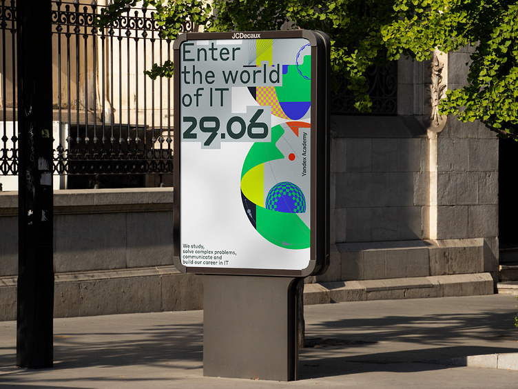
Yandex Academy: Outdoor communication
Yacamemy Brand Identity
Visual language for IT
educational platform
Yandex Academy includes seasonal schools, lyceum, partnership programs with universities, School of Data Analysis, courses, intensives, and olympiads for schoolchildren, students, and novice IT specialists.
Yandex Academy's brand identity is shaped by the “Life is a hackathon” concept — moving from project to project, students constantly improve their knowledge. Being in a flow state, they are more focused on discovering new stuff than obsessed with achieving measurable goals.
The design system embodies this idea in a set of volumetric spheres or universes, into which the small red ball is inscribed — it wanders through them. While the ball overcomes new obstacles, it transforms the inner structure of spheres.
This ball is, at the same time, the sign of Yandex Academy. Together with the wordmark, the typography set, which includes Yacademy custom font and Styrene typeface, corporate color palette, and graphics, the ball shapes a universal visual language that signifies programs for different audiences, partner projects, and collaborations.
Anastasia Butrym | Creative strategy director
Ivan Velichko | Creative director
Dasha Zudina | Design director
Varvara Goncharova | Type designer
Evgeny Drozhzhev | Designer
Konstantin Frolov | Designer
Dina Isayeva | Designer
Dmitry Kozlyaev | Lead motion design director
Anton Gremyakov | Motion designer
Daniil Svetlov | Motion designer
Alexander Maslyuk | Sound designer
Anna Eremina | Project manager
Vasili Kolesnik | Head of content
Ekaterina Scherbakova | Content producer
