Branding - Logo Moonie's Oasis
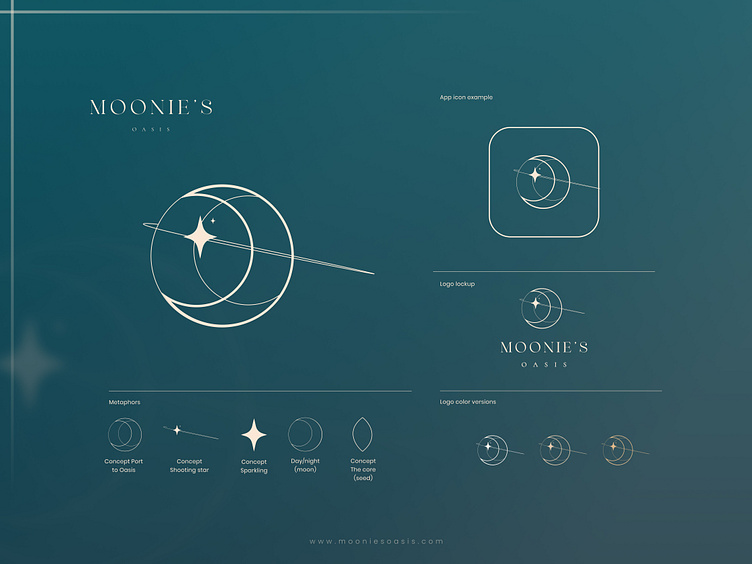
The logo of Moonie's Oasis is a refined and stylish design that evokes a sense of elegance and confidence. In the center of the logo, two carefully crafted crescent moons merge to form a sleek, stylized almond-shaped gateway. This symmetrical gateway symbolizes the perfect balance and harmony between the natural oils from Dubai and the high-quality beauty products that Moonie's Oasis offers. Additionally, this natural shape represents the organic products and seeds used in Moonie’s Oasis products.
A stylized, powerful star effortlessly cuts through the almond-shaped gateway as a symbol of progress and success. It represents the brand's ambition to fulfill women's dreams and goals, giving them a sense of confidence.
The color palette of the logo exudes serenity and elegance. Deep blue and pink tones symbolize refinement and reliability, while subtle golden accents add a touch of luxury and glamour.
The typography of the company name "Moonie's Oasis" has been carefully chosen to create a powerful and confident look. A clean, balanced letter style emphasizes the professional and reliable nature of the brand, presenting the company name clearly and legibly.
This completed logo embodies the core values of Moonie's Oasis as a leading brand in the beauty industry. It exudes serious elegance and empowers women to be themselves and feel confident. The logo inspires a sense of reliability and ambition, encouraging the target audience, especially women, to stand proudly and confidently in their own beauty.
Regenerate
