Welcome Screen
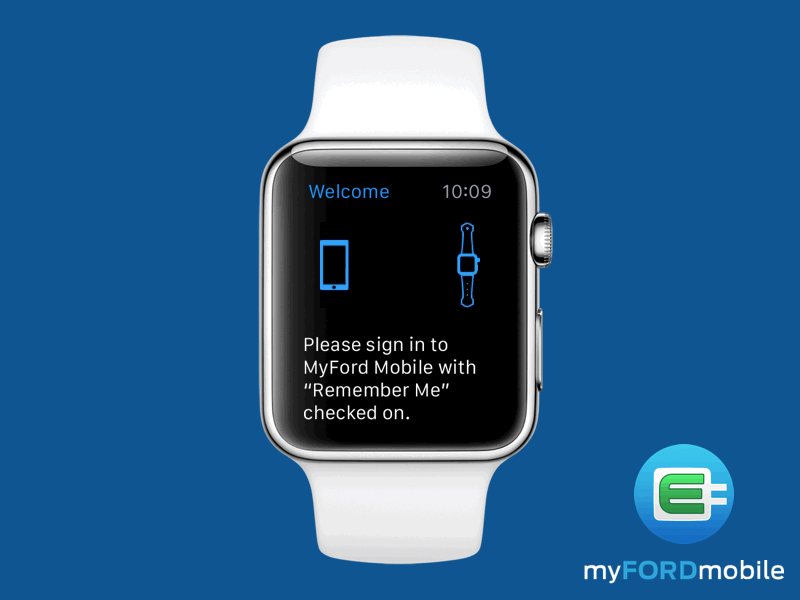
This is a really simple screen and animation I made for the MyFord Mobile app's log in page.
I decided to use pretty simple shapes and make the animation go only one way to help focus the user attention on the phone. We did have some more explicit text about looking at the phone, but found with the animation present most people understood the direction to view their phone. Just goes to show you that a good animation can help provide a lot context in areas where screen real estate is limited.
I also really like the cute little graphic of the watch. I did try out some other bands, but settled on using the Sports band because I figured that had the most universal appeal for our drivers.
