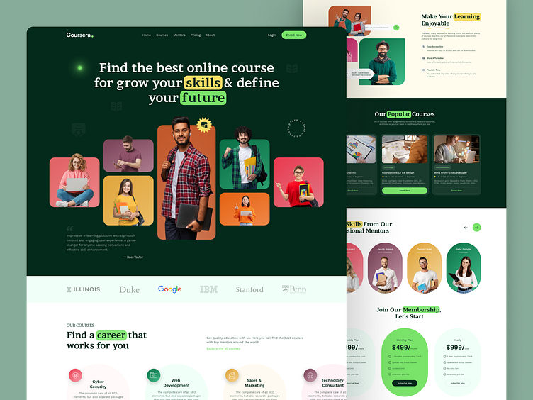
Coursera Redesign Concept
Hello Dribbblers,
Say hello to a smarter, sleeker Coursera! Have you ever reimagined the Coursera app from a different perspective? If not stunning blue, then what? Well, our designers did! With their creative vision for the app redesign and giving it a more elegant look with a clean interface, seamless navigation, and personalized course recommendations, learning has never been this engaging! Check out the transformation, and let us know what you think! 🌐
🔍 Want to know a bit more about how to develop such an app?
Check out our latest blog on "How To Build An eLearning Platform Like Coursera?” for better insights!
Get in touch, and let's build something awesome!
Here are our contact details:
✍️ Contact us on https://www.mindinventory.com/contact-us.php
📩 Email us at sales@mindinventory.com
🌎 Know more about us by visiting our website: https://www.mindinventory.com/


