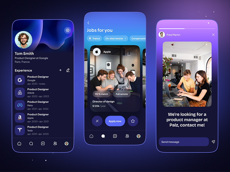
Linkedin - A redesign concept - Part 2
What's the idea behind this concept?
The idea was to give Linkedin a boost and try to optimize certain navigation elements. Users would be able to access an "explorer" tab, where they would be able to access top creators, posts, schools, but also job recommendations linked to their profile. This is totally experimental and just for fun.
What tools do I use?
Figma
Who I am?
I'm a freelance product designer passionated about mobile applications and a lover of users.
My website
I am open to new projects
More by Méghane Lemonnier View profile
Like
