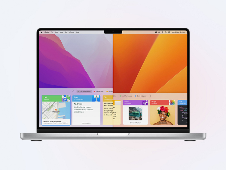
Paste Evolution Through the Years
As technology evolved over the years, so has Paste. Our mission has always been to enhance the user experience and productivity, constantly adapting and innovating to stay ahead of the curve. Today, we invite you to travel back in time with us as we unveil the transformation of Paste over the years.
2015: The Inception
Paste began its journey with a full-screen, expose-like experience, which helped users focus on the context they were currently in. It enabled them to store various types of copied content and use them across different apps easily.
2016: Integration in Daily Workflow
By 2016, after analyzing user feedback, Paste had transformed to fit seamlessly into users’ daily routines. We refined the logic behind its appearance, so the window now acted more as a subtle extension than a disruption, facilitating easy access to users’ clipboard history without interrupting their ongoing tasks.
During this period, we also introduced pinboards to enhance organization, allowing users to keep their most frequently used content at their fingertips. Alongside this, we optimized the preview of copied items to better spotlight the content.
2020: Going Cross-Platform
In 2020, Paste was no longer exclusive to Mac; it had expanded to iOS devices, taking productivity to a whole new level and extending unlimited clipboard to the cloud.
While the spotlight was mainly on the iOS release, we didn’t neglect Paste for Mac. We fine-tuned the design to align more closely with the latest macOS standards. The improvements were notable - Paste had adapted seamlessly to dark mode, and the Paste items now supported links and color previews.
2023: The All-New Paste
Earlier this year, with the launch of the latest update, we took another big leap forward in the design game. Every aspect of the interface was honed and polished, setting a new standard in harmonizing aesthetics and functionality. The Paste window was reshaped from the ground up, adapting to the latest standards. While we kept the foundational concepts, the focus shifted towards enriching the content overview.
With this update, we didn’t just focus on the aesthetics; we elevated the overall app performance significantly. Now, the clipboard and pinboard lists boast smooth, native scrolling and animations, enhancing the fluidity and ease of navigation within the app.
Check out more details on the latest version in our blog post. Follow us to discover more about the design, newest features, and more.


