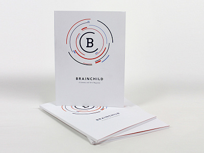
Brainchild 2014 Edition
The first edition of Brainchild was designed to have a simple and clean feel. Throughout the magazine line elements and circles are incorporated to establish unity between the logo and the magazine. The circle elements feature artwork that the viewer has just seen, or will see. They are used to emphasize the narrative thread that carries through the magazine.
More by Martha Bergmann View profile
Like
