eFootball - Redesign
Football has always been my great passion, and the game eFootball, formerly known as PES, has always been part of my journey in this universe. With the latest update, I decided to do an in-depth study to demonstrate his potential.
In this study, I sought to create a redesign that incorporated modern, dynamic and authentic elements.
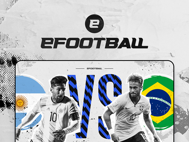
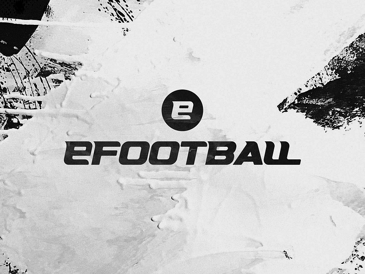
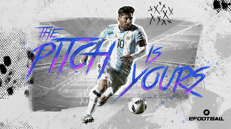
A faster brand
The first highlight is the new logo. It is a representation of what we can expect from the game: modernity and speed.
Back to origins
The new visual identity embraces root and rustic football, connecting with the natural essence of the sport
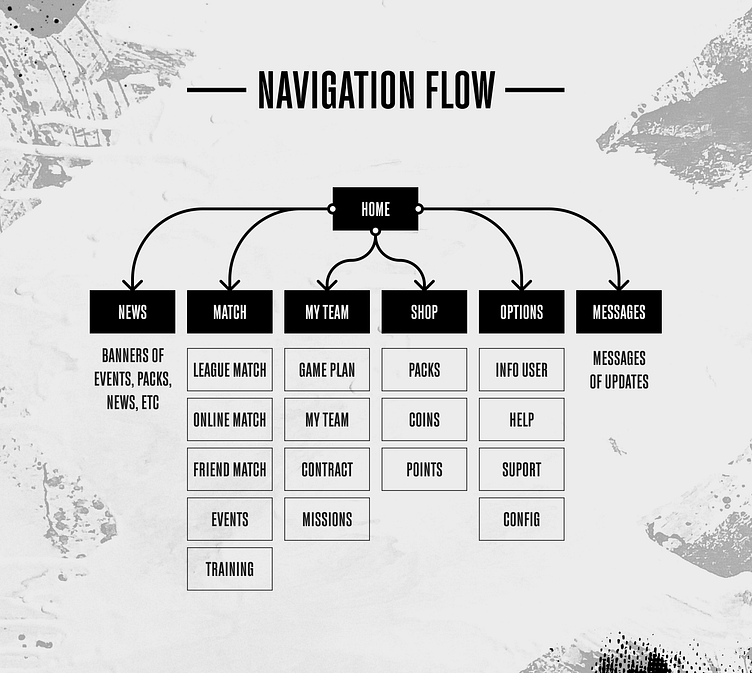
A true UX
I improved the user experience by making it more efficient and intuitive. The navigation flow has been redesigned to be faster, making it easier to search for what you need in a simple and uncomplicated way, without getting lost in a maze of options.
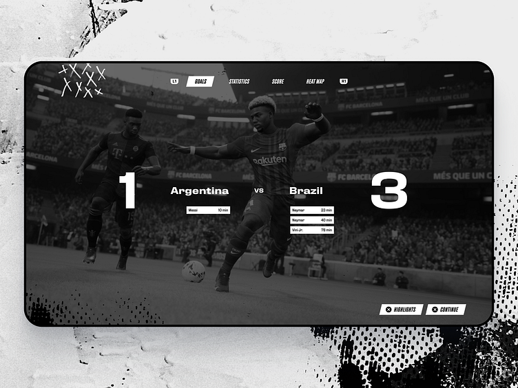
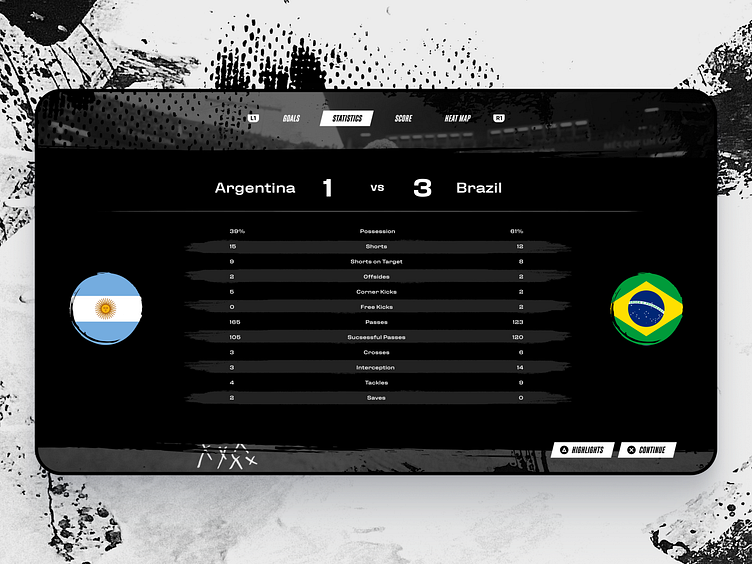
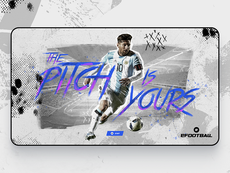
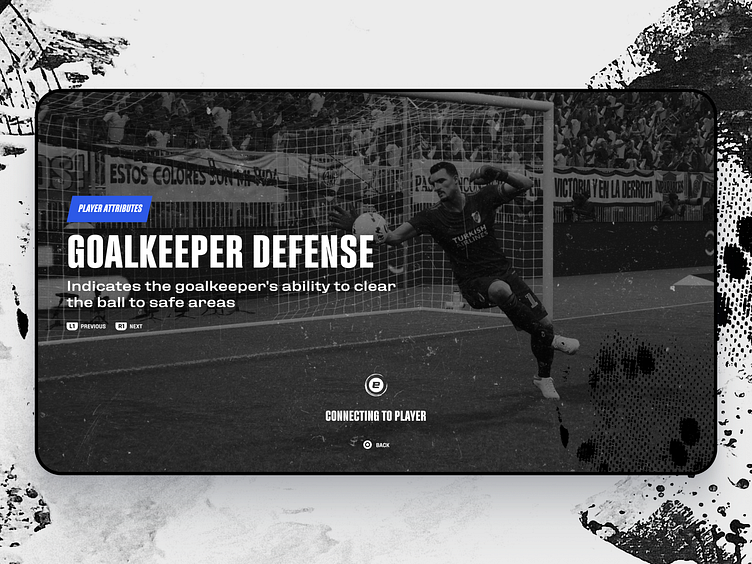
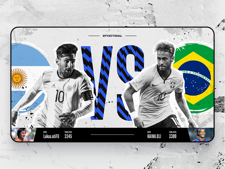
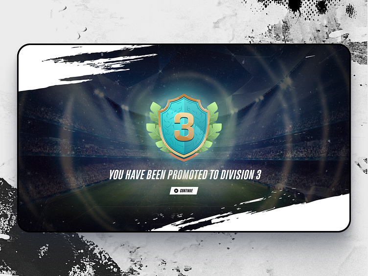
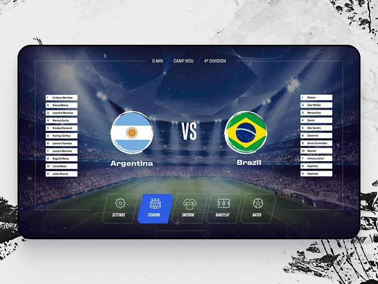
New interfaces
Another change was a complete redesign of the interfaces. Everything has been rethought to make the experience more enjoyable, from navigating the menus to configuring tactics and accessing information about the match.
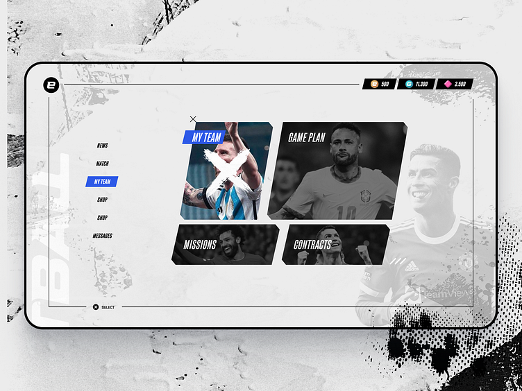
New navegation
On the home page I brought a new navigation structure, focusing on easier usability through directional controls
We also have a new coin iconography, to facilitate visual differentiation between them
New badges to make more powerfull the evolution
The new Pre-Game interface is cleaner and aims for easy access to all match settings options.
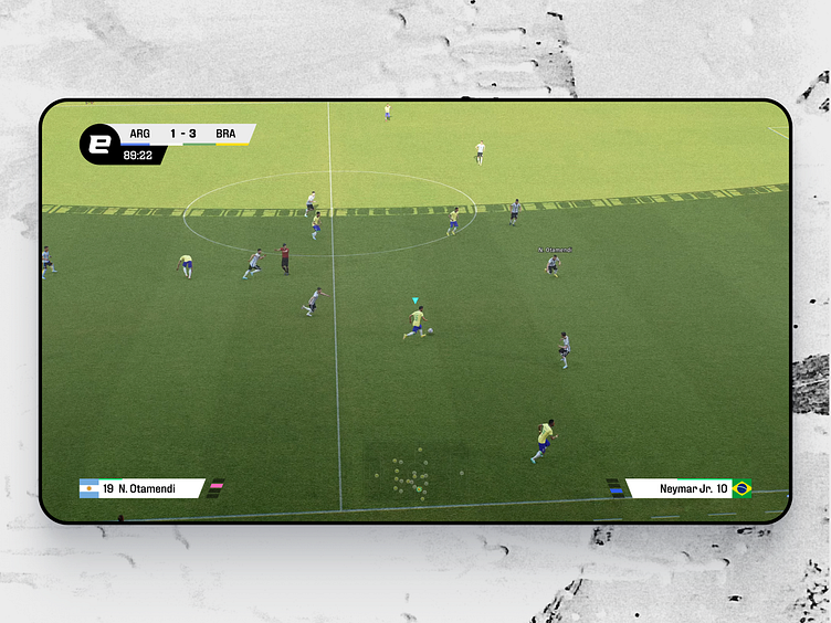
Broadcast bars, based on new ID
New post-game navigation, making it easier to view information