Template
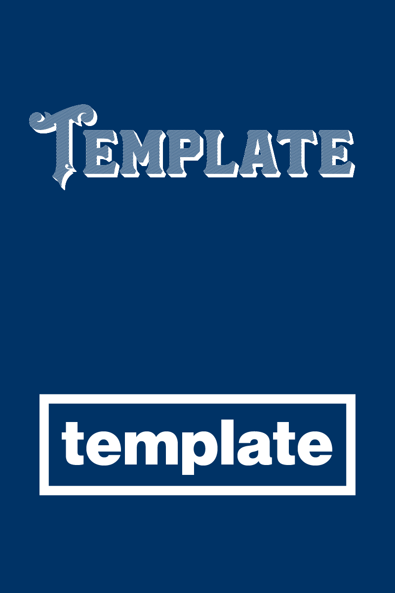
A couple different logo directions for a private label denim company here in NYC.
The first is a 19th century throwback kind of deal which takes inspiration from the really ornate engraved lettering that the Sanborn Map Company had on their covers (look them up, there's some *crazy good* stuff that they commissioned). The second is just straight-up NYC subway-style with Neue Haas Grotesk (in which I was able to work in the alternate "a"!—I'm quite pleased with that).
I don’t think I’ve ever had two directions for an ID that have been *so* different from one another.
More by Jack Curry View profile
Like
