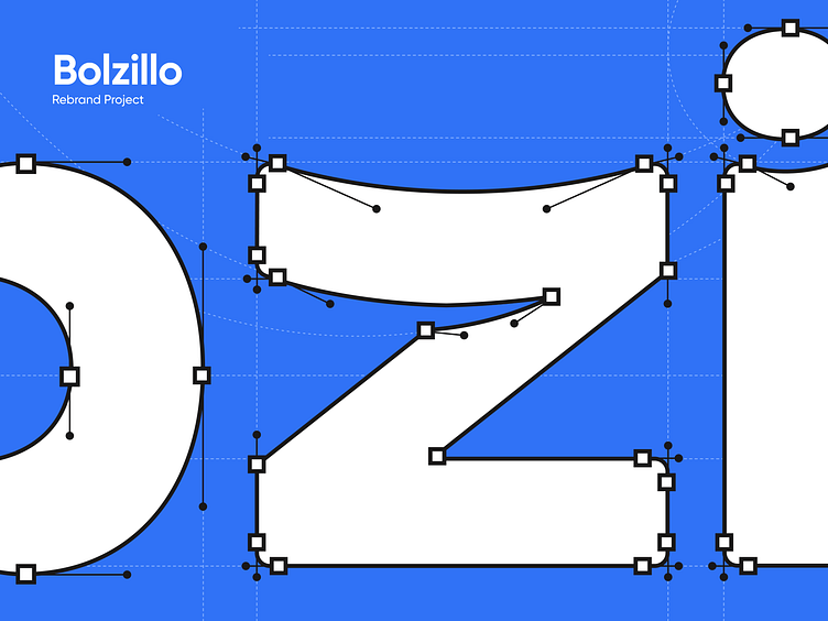
Bolzillo: A logo that fits the brand
Bolzillo is a Latin American app that makes money transactions at registered businesses a breeze. Say goodbye to the hassle of bank cards – all payments are seamless and digital. With features like fund management, shared expenses, and savings support, Bolzillo simplifies and enhances users' financial experience.
The essence of Bolzillo lies in its handiness; its name playfully nods to a pocket ("bolsillo" in Spanish), symbolizing proximity, security, and ease of access. In light of that, our Branding Team got to work and visually embedded the brand's core concept into its logo.
We identified the 'Z' as the perfect canvas for carving out the pocket's symbolism, by employing a clever visual twist using negative space. Additionally, we shaped the wordmark's edges with soft contours, just like the folds of fabric in a pair of trousers. To enhance the concept even further, we chose a blue hue that mirrors the timeless shade of classic denim jeans. The result? A simple, fun, and distinctive logo that instantly conveys what Bolzillo is all about.


