Holy Taco - Design
About
Client: Rebel Tang, a technology start-up that creates and manages virtual restaurants.
My role: UI Design, UX, brand identity.
Duration: 1 month
Team size: 3
Technology: Figma, PS Beta
Scope: UI, UX, Branding


Problem
Create a visually appealing restaurant website that would also generate a high level of conversions. Reach potential B2B partners.
Objective
Create an attractive, unique restaurant website that would be effective in generating conversions (orders). The user should be able to easily get to know the restaurant, familiarize themselves with the menu, and move painlessly into the process of ordering food.


Solution
Together with Rebel Tang's marketing department, we went through the design process.
Selected 4 personas (2 for B2C and 1 for B2B)
Extensive research on the history of French tacos and the Mexican taco heritage
Website design based on a grid system
Smooth microinteractions
Call-to-actions and links in the footer
Benefits
Rebel Tang gained a visually appealing website, which was well received by consumers and Rebel Tang's partners
Well-received by consumers and Rebel Tang's partners.
Several leads acquired via the contact us tab.
Positive impact on sales (if I could, I would measure this indicator precisely)
Lower rejection rate (if I could, I would measure this indicator precisely).
Summary
Overall, the project was a success. We were able to create a visually appealing and effective website that met the needs of the client.
FULL VIEW
Here is a detailed look into the Holy Taco project.
User Research
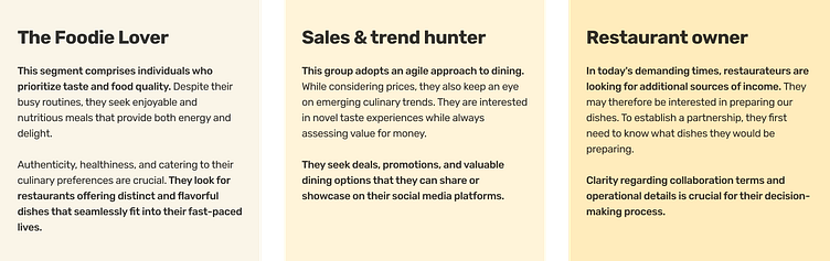
Our design process began by prioritizing the most crucial element of UX design - the user. For the purposes of this case study, we have identified 3 user groups.
Gathering User Perspectives
During a collaborative session with representatives of our user groups, we had the opportunity to learn more about their eating habits and expectations from restaurants offering food delivery. Through the discussion, we gained valuable insights that helped us better understand their needs and preferences.
Unique French Tacos experience: One of the individuals shared her first experience with French tacos, which she had the chance to try during a skiing trip in France. It was a unique and flavorful encounter that she would like to replicate, without necessarily having to travel abroad.
Craving for diversity and innovation: Both participants expressed a common sentiment that the market lacks diversity and less typical dishes available for delivery. They conveyed a sense of weariness with repetitive options like kebabs, pizza, and sushi. They emphasized a desire for something fresh and innovative, setting it apart from the standard choices.
Convenience and novelty in delivery: Throughout the conversation, they revealed that they often have limited time to prepare meals at home and seek convenient and tasty delivery options. They also showed an interest in more unconventional flavors and inspiring menus, accessible through delivery.
The insights gathered from these discussions allowed us to identify significant gaps in the market where Rebel Tang could stand out and meet the expectations of our potential customers.
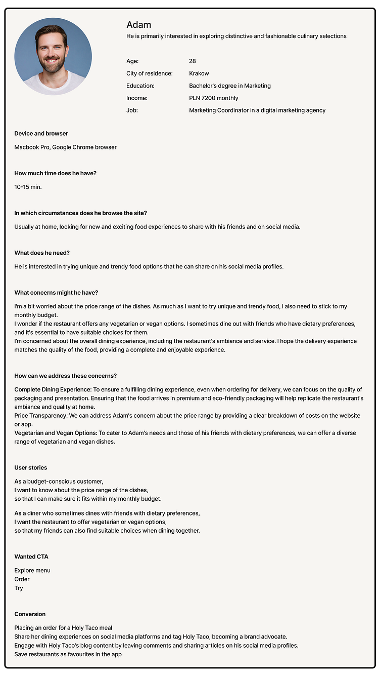
Personas
Throughout the design process, our main focus was on two consumer personas. Although a B2B persona for a restaurateur had been previously developed by Rebel Tang, it was not our primary focus and we concentrated on the consumer personas instead.

Competitive Analysis
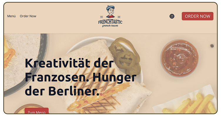
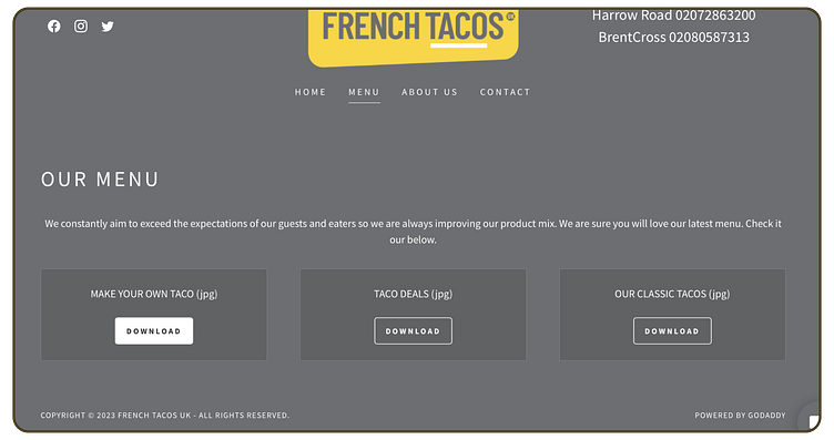
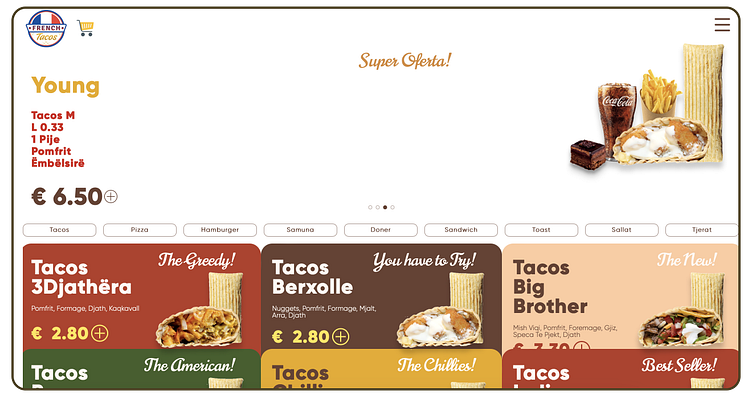
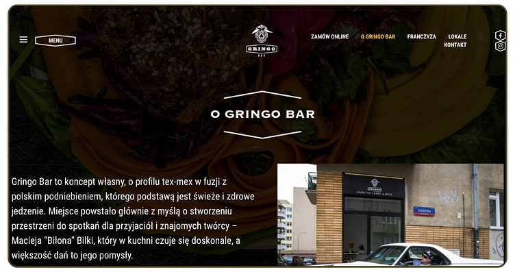
We analyzed competition in Poland and Europe, and found French Tacos to be a unique concept with minimal competition. Our only identified competitor lacks a website. We also looked at international restaurants for a comprehensive understanding of the market. This informed our approach for the Holy Taco project. We analysed brands such as Gringo, Frenchtastic, French Tacos UK, and French Tacos Uhilas, for example. Here are the findings.
Pain Points
Below, we present a list of key pain points that we consider crucial to address in terms of UX/UI. These pain points have been identified through a thorough analysis of the competition and will guide our efforts to optimize Holy Taco's user experience.
Excessive textual overload
Most of the competitor websites suffer from an overwhelming amount of text, which can be intimidating and off-putting to users seeking quick and visually engaging information. The abundance of text often overshadows the core offerings and dilutes the immediate appeal of the brand.
Low text-to-background contrast
Many competitors struggle with maintaining a balanced contrast ratio between text and background. This issue not only compromises readability but also diminishes the visual impact of the content. Users may find it challenging to decipher the information presented, leading to frustration and a suboptimal user experience.
Buried dish imagery
Most of the competitor websites suffer from an overwhelming amount of text, which can be intimidating and off-putting to users seeking quick and visually engaging information. The abundance of text often overshadows the core offerings and dilutes the immediate appeal of the brand.
Limited visual appeal
Most of the competitor websites suffer from an overwhelming amount of text, which can be intimidating and off-putting to users seeking quick and visually engaging information. The abundance of text often overshadows the core offerings and dilutes the immediate appeal of the brand.
Lack of Video and Animation
A noticeable absence of video content and animated elements characterizes the competitor websites. This significant deficiency impacts the potential for user interaction and the ability to convey information in a dynamic and engaging manner. Incorporating video and animation elements can significantly enrich user experiences, fostering more engaged interactions with the brand.
Disproportionate element sizing
Some competitor sites exhibit issues with element sizing, including oversized sticky menus that occupy a substantial portion of the screen real estate. This imbalance can hinder users from exploring the rest of the content and disrupt their navigation, contributing to a disjointed browsing experience.
Weak information architecture
Many competitors lack a clear and intuitive information architecture, causing confusion among users as they navigate through the website. A coherent and well-structured architecture is vital for guiding users seamlessly to relevant sections and ensuring they can effortlessly access the information they seek.
Absence of negative space
The excessive use of elements without proper spacing creates a cluttered visual environment that overwhelms users. The lack of negative space impairs the overall aesthetic and makes it difficult for users to focus on essential content. Design elements should be thoughtfully organized to provide breathing room and enhance visual clarity.
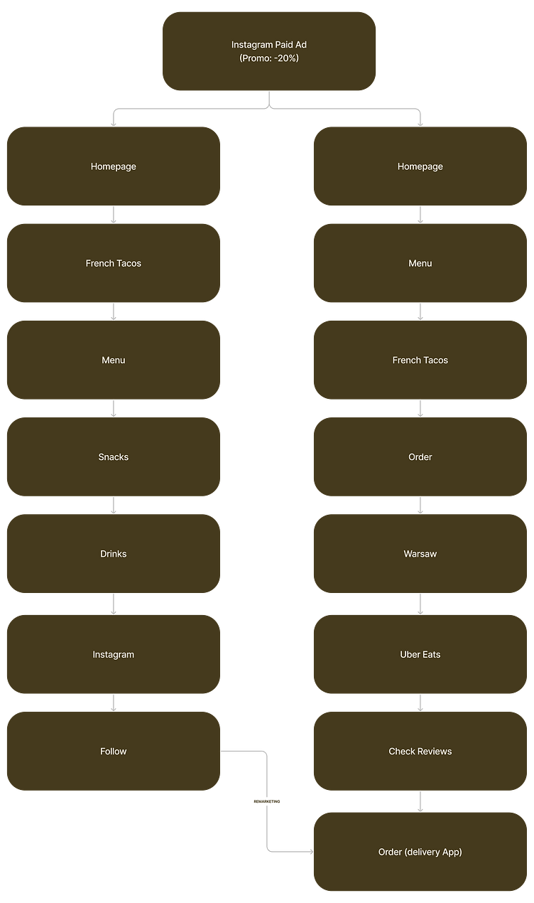
Creating the Information Structure
Upon reviewing insights from interviews and competitive analysis, I formulated potential user flows as follows:
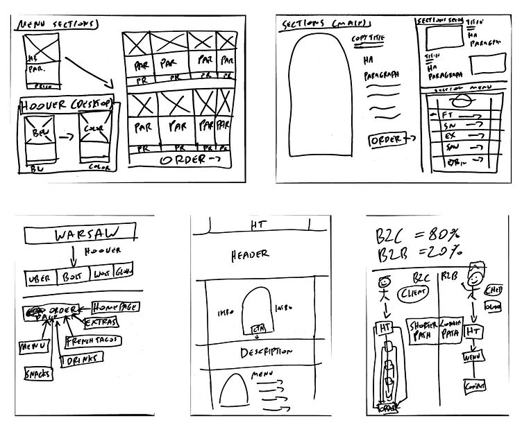
Wireframing
I found that using classic paper and marker before starting with the Figma frames was a great idea. It allowed me to create wireframes and discuss them with team to come up with new ideas that we hadn't thought of before. Working with low-fidelity prototypes really helped us to identify necessary design changes much faster, and this resulted in saving a lot of time and effort.
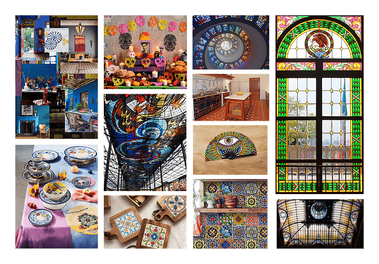
Designing the Brand Identity
When tasked with developing a logotype and brand identity for a restaurant, I decided to start my research in Mexico, exploring the visual treasures of the country's rich culture. I wanted to capture the unique character of Holy Taco's cuisine, so I minimized the use of direct benchmarks like web screenshots. By delving into the heritage of Mexican culture, I was able to create an identity that truly reflects the essence of the restaurant.
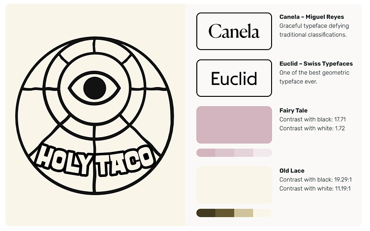
Fonts
Miguel Reyes' expertly crafted Canela typeface captures the vibrant cultural essence and artistic flair of Mexico. The font seamlessly blends historical and modern elements, much like the diverse traditions and influences found in the country. Its elegant curves and unique character are reminiscent of the intricate details found in traditional Mexican architecture, from the ornate facades of colonial buildings to the captivating motifs of ancient temples. This typeface exudes warmth and authenticity, reflecting the welcoming spirit and genuine connections deeply ingrained in Mexico's social fabric. Each letter of Canela pulsates with movement and rhythm, much like the lively beat of Mexican music and dance. This ensures that every word written with the font is a harmonious expression of Mexico's artistic heritage.
The Euclid font, created by Swiss Typefaces, is a perfect blend of modernity and traditional appeal that adds a touch of sophistication to Mexico's diverse cultural heritage. It seamlessly integrates contemporary design with timeless aesthetics, just as Mexico's art scene evolves while honoring its roots. Euclid's clean lines and geometric precision reflect the sleek styles of modern Mexican architecture, where innovative structures fuse with traditional patterns. Its versatility echoes the colorful interplay of patterns and hues found in Mexico's vibrant textiles and pottery. The font captures Mexico's spirit of progress and innovation while paying homage to its enduring traditions that shape its identity. Whether you use it in digital interfaces or printed materials, Euclid lends a cosmopolitan flair to any project, reflecting Mexico's status as a hub of cultural diversity and artistic experimentation.
Colors
One color that stood out to us was "Old Lace," which reminded us of the soft, creamy shades of Mexican beaches and the warmth of the sun.This color also represents the hospitality and unique blend of nature and architecture found in Mexican cities and villages. It conveys a sense of comfort and tranquility, much like the experience of enjoying traditional dishes and joyful dances on a pleasant Mexican evening.
The color "Fairy Tale" is inspired by the enchanting tales and folklore of Mexico. This soft shade reflects the intricate craftsmanship and attention to detail found in traditional Mexican textiles, ceramics, and artwork. Similar to the pages of a magical storybook, "Fairy Tale" brings a feeling of wonder and nostalgia, taking us to a world where ancient legends and colorful celebrations come to life. It captures the essence of Mexico's diverse cultural heritage, adding charm and mystique to every touch and texture, reminiscent of the captivating narratives and vibrant traditions that form the heart of Mexican culture.
Conversion path overview
During the design process, my emphasis was on catering to the expectations of both individuals acquainted with the French Tacos dish and those encountering it for the first time.
Experienced Holy Taco enthusiasts can swiftly access a dedicated subpage for French Tacos, while newcomers have the option to explore the menu's various subpages at their own pace.
Both user segments possess the ability to swiftly access the "Order" subpage through a variety of CTA buttons.
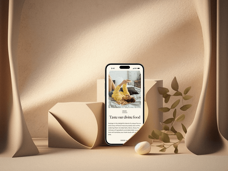
Homepage
Our journey begins on the homepage. Although not every user starts there, most do.
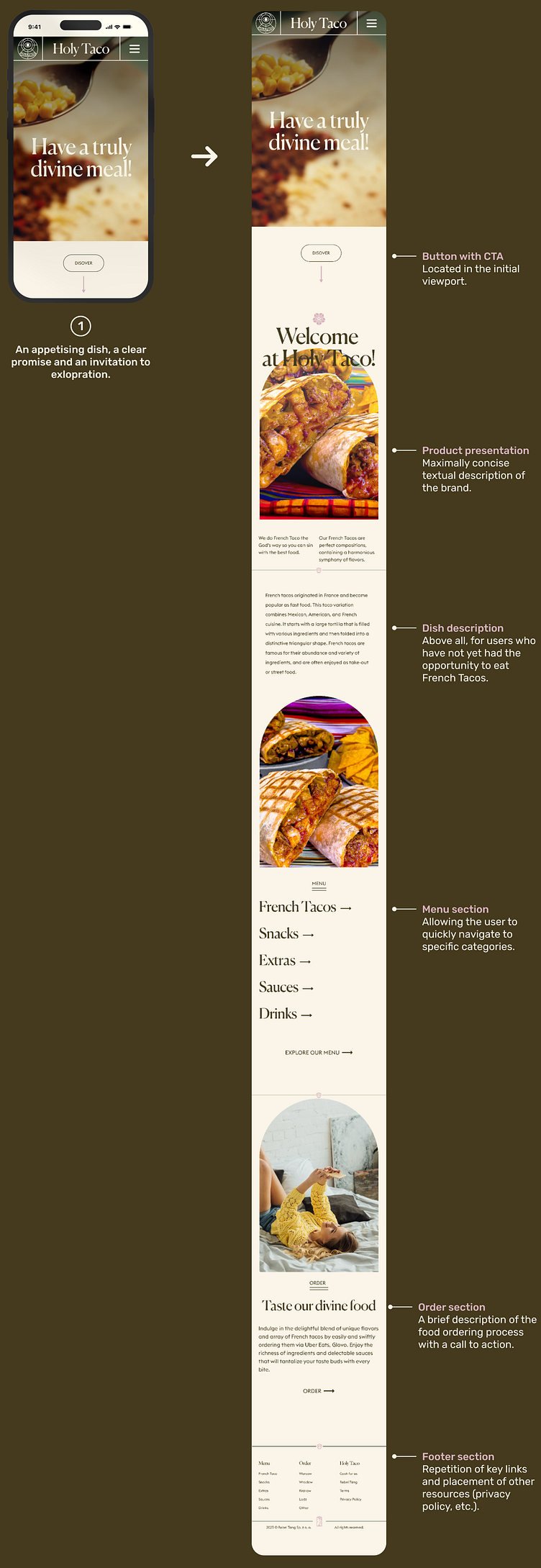
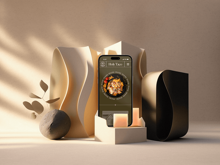
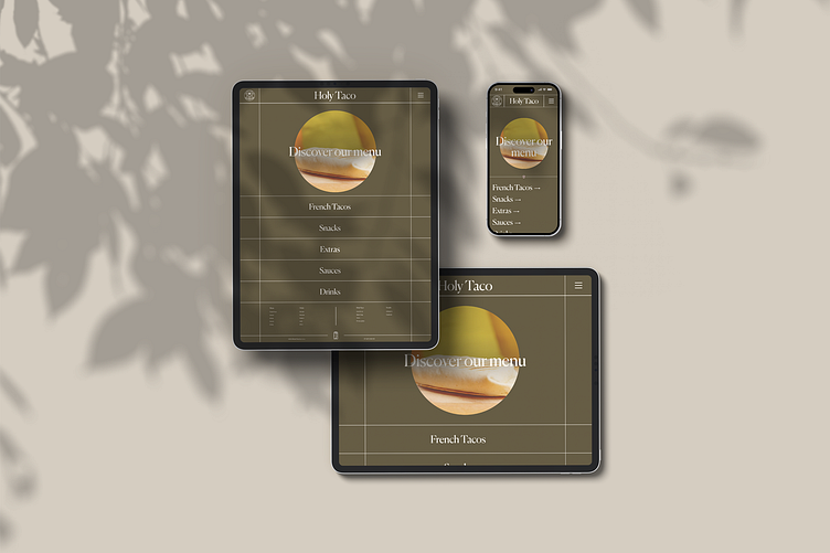
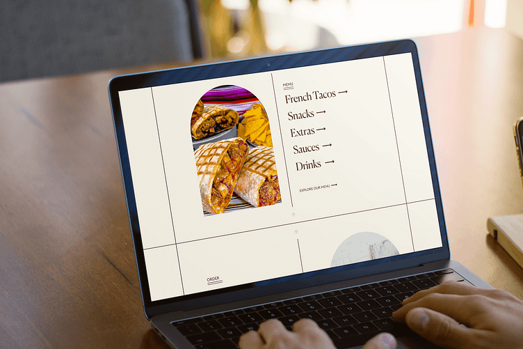
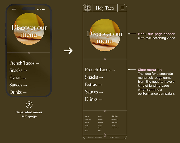
Menu
Due to the client's expectation of being able to implement a performance campaign using the Holy Taco website, I therefore made a design decision to create a separate menu subpage. This allowed Rebel Tang to first present the Holy Taco restaurant offer on social media, encourage people to order food, and finally locate a link to the menu (or order page) at the button level with a CTA.
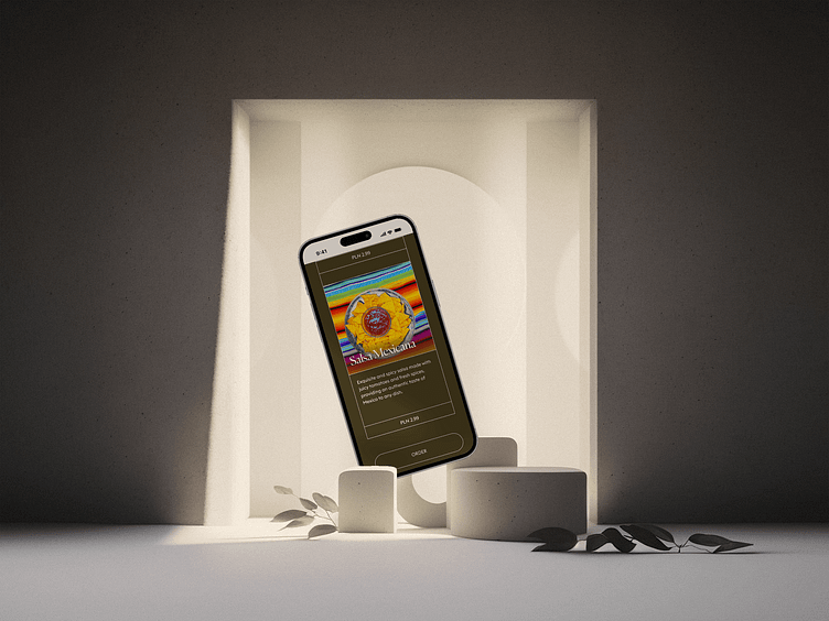
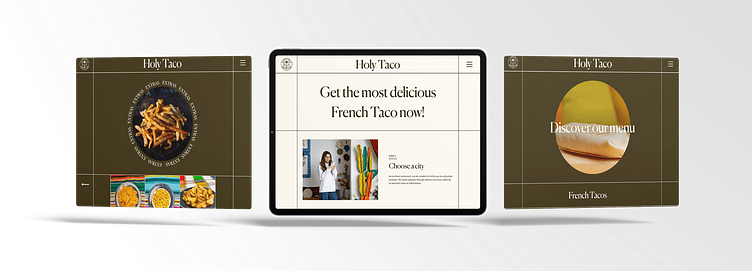
Dishes
On each of the sub-pages with dishes, the user sees a transparent price list and concise descriptions of the dish. As early as the research stage, we realised that price transparency and clear descriptions could be extremely important for our target groups.

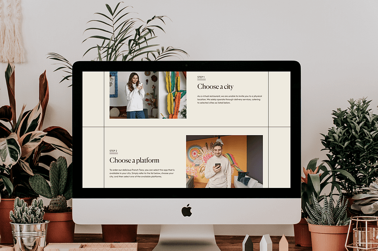
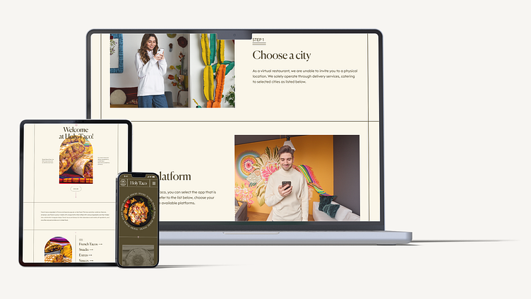
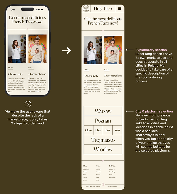
Order
The information architecture of the order subpage was intended to simplify the presentation of the food ordering process as much as possible. We decided that 'two steps to eat' sounded pretty good. In the city and platform selection section, we decided on a solution in which the user selects his/her city by tapping, and a moment later has the option of selecting the platforms available in his/her city. In this way, we reduce irrelevant (from the user's point of view) information and increase the clarity of the design.
That's a wrap!
Looking back on my experience with the Holy Taco project, I realized it was a major achievement as my first big commercial venture where I oversaw the design process from start to finish. This experience taught me a lot about UX/UI design, working with clients, and managing projects. Although there are things I would do differently now, I am proud of the project as it shows how I have grown as a designer and how I was able to capture the unique spirit of Holy Taco's food journey.
Key takeaways
When working on the project, I made sure to consider both the customer experience and the overall business goals in my approach.
The project highlighted the significance of maintaining a cohesive creative vision throughout all design elements. This often required clear and assertive communication with the client to ensure the project's integrity was upheld.
I found crafting this project to be incredibly fulfilling. My personal commitment was to create a restaurant website that not only meets professional standards but is also user-centric. I imagined a platform that would make me eager to place an order as a customer.
Looking back on the project, I believe it's important to stress the importance of advocating for usability testing. If given the chance to revisit the project, I would prioritize this step even more vigorously.