Dryg - Blue Collar ATS platform
Cooperation with Dryg shows the value of partnership approach in software development. When working for Develocraft, client's initial goal was to help (developers only) with the development of a web service and the platform’s mobile app (iOS, Android).
Dryg was a child product of a larger job board brand which goal at that time was to explore the field of blue collar employees. As a constantly and rapidly evolving platform Dryg started to struggle with inconsistency in the design and user flows. Develocraft's developers found out that the workflow with the design files was not as efficient as they are used to when working with me. I have analyzed the process as well as the platform's user experience and reported those issues to Dryg. Fortunately they were open to include me to try to optimize and improve the process as well as help to improve the general User Experience of the whole platform (Job board and Employer ATS, web & mobile apps).
My job included UX audit, platform redesign with improved user experience, design - development process optimization. I have also introduced interactive prototypes to the design process to gather better insights from the users.
Main addressed areas included:
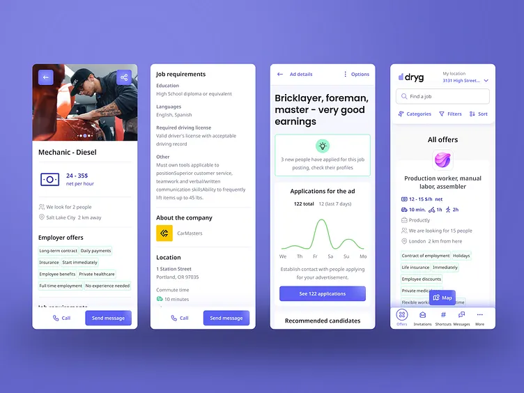
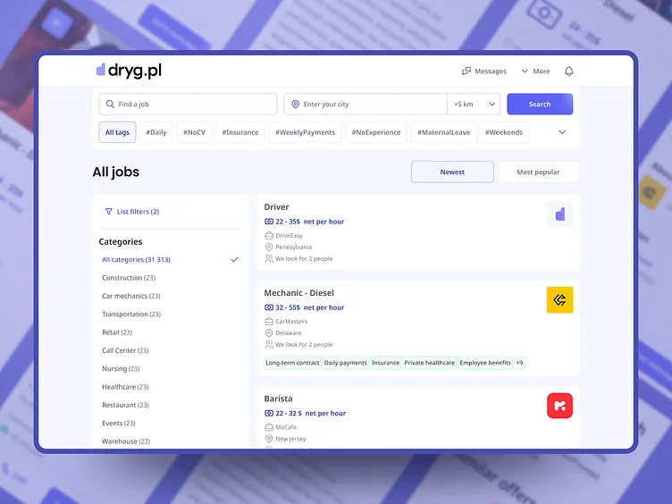
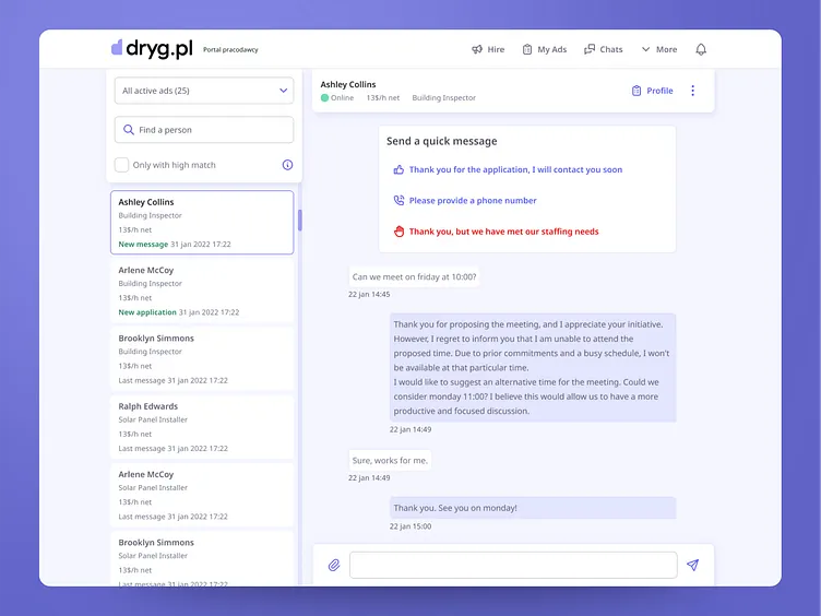
Clearing up user flow and better distinction between using the Job Board as a user actively seeking a new job and Employer ATS - that tracks applicants and job offers. We’ve created improved main navigation with clear login page showing the user to which part of the platform he is logging in.
System’s behavior improvements when using Job listing - We got rid of pagination allowing users to use infinite scroll. Getting into an offer page and returning to the listing would now return to the place where the user was before, with all of the filters selected. It was infuriating existing users before the change because there was no fast and efficient way to go back.
Improving event trigger areas - larger buttons, larger input spaces and other controls allowed users to be less precise about clicking/tapping and by that decreased the cognitive load with using the interface. The whole platform has become more acessible and easier to use.
Speeding up task completion time - we’ve tried to remove as many as possible of redundant steps in user flows, rethinking their purpose while still keeping an eye for current code’s architecture limitations. The need to jump around/scroll through the interface to e.g. reach critical buttons was significantly reduced in major tasks (like applying for a job).
Edge case coverage - we’ve worked closely with the development team to remove dead end’s and unlogical redirects in various situations which were not covered in the initial designs. For example we’ve changed the link building approach for job offers, which contained job category, when a user would enter an expired link to a job, the system would inform him about it and show similar offers from the same category.
Key improvements
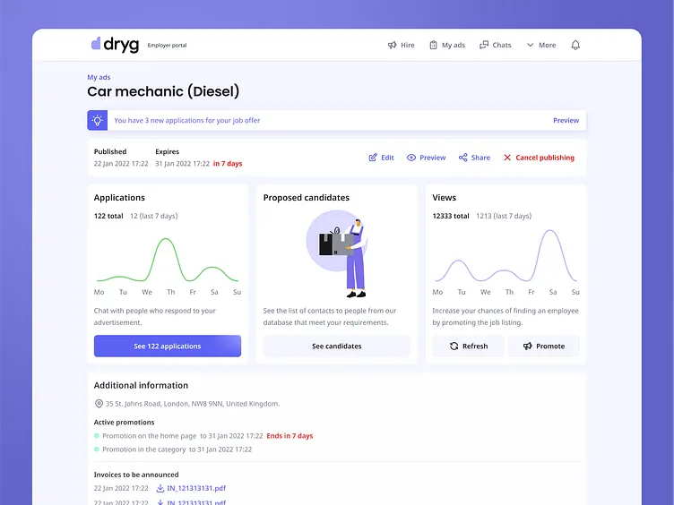
We’ve set up improved workflow between the design and development teams that was faster and required less assistance which also improved the delivery quality.
With our help Dryg mobile apps stopped receiving bad ratings that pointed out usability issues and weak user experience. App rating improved significantly in short period of time. (From 3.6 to 4,5 in 3 months)
I have cooperated strongly with the client to remove inconsistencies in the design system and improved general aesthetics of the product.
Creation of a one design file that contained all of the necessary design information which improved the information flow between team members.
Our UX improvements also helped to increase the level of job applications per user as well as other KPI’s.