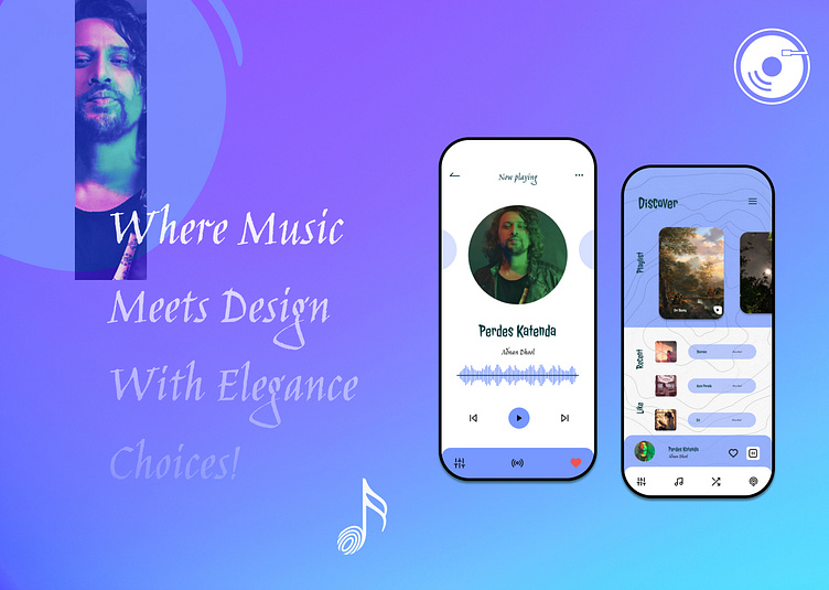
"Harmonia: Where Music and Design Converge"
In the heart of a bustling city, nestled among the creative chaos, there lived a visionary named Alex. Alex was passionate about music and technology, and one day, inspiration struck like a perfectly timed beat drop. They decided to create a music app that would revolutionize the way people experienced their favorite tunes.
Color Palette:
The calming #7798FE blue represented the tranquil waters of musical expression.
The deep, mysterious #0A3B41 green conveyed the depths of musical discovery.
Crisp, pure white symbolized the blank canvas of endless possibilities.
The enigmatic black added an element of sophistication and timelessness.
Typography:
Jolly Lodger, a bold and eye-catching font, was chosen for the main headlines. It echoed the enthusiasm and excitement that music brings.
Jim Nightshades became the soul of the app, gracing the body text with its elegance, making every word dance on the screen.
Iconography:
Alex knew that the icons were the visual harmony of their creation. They meticulously curated a collection of music icons, each one telling a story of rhythm, melody, and emotion. From musical notes to headphones, these icons would guide users through their musical journey.
The Design Process:
Alex began by sketching out the app's wireframes, creating a fluid and intuitive navigation system. They envisioned a clean and minimalist interface, using white as the backdrop, with the blue and green accents adding pops of color in just the right places.
The app's logo, a stylized musical note in the signature blue hue, would be a beacon of recognition for users.
Creating the User Experience:
The user experience was paramount. Alex made sure that every button press, swipe, and interaction was as smooth as a perfectly played chord progression. They added a 'Discover' section, where users could explore new genres and artists, and a 'Favorites' feature for saving beloved tracks.
Personalization:
One of the app's key features was personalization. Alex believed that music should be as unique as the listener. They incorporated AI algorithms to recommend new tracks based on user preferences, ensuring that every listening experience was a delightful surprise.
The Final Crescendo:
After months of tireless work, countless iterations, and a dash of artistic genius, Harmonia was born. It was an app where music and design converged, where every element was thoughtfully crafted to elevate the user's experience.
Conclusion:
Harmonia wasn't just an app; it was a symphony of design, a masterpiece of technology, and a portal to the infinite world of music. Alex's passion and vision had come to life in the form of an app that would accompany music lovers on their journey of discovery, one beautifully designed note at a time.
