Fintech Transactions Dashboard (Dark Mode)

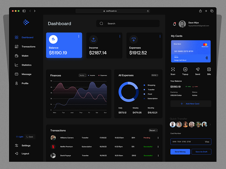
Hey everyone, I recently had the opportunity to enhance the transaction page's dark mode for a fintech web app.
This was all about gaining a deeper insight into the inner workings of dashboard pages and making the user experience even better.
View Full Design: Behance
What do you guys think? Let me know in the comments section!
Hope you guys enjoy it. Press "L" if you like it. 🔥🔥🔥
Let's talk: fayeye1david1@gmail.com | twitter || Whatsapp
Thank you !!